People are constantly choosing colors, even if they are not consciously aware of it. This is often done instinctively, but there is actually a science behind it called color theory. Color theory explains how different colors relate to each other and the visual effects that are created when they are combined in different color schemes.

In this comprehensive guide, we will explore the fundamentals of the color wheel (color tone is covered), color theory, and color meanings, and their relevance to visual marketing, branding, and design.
The Concepts about Color Tone
Before we dive into the nitty-gritty of color theory, let’s take a quick look at some basic terminology.
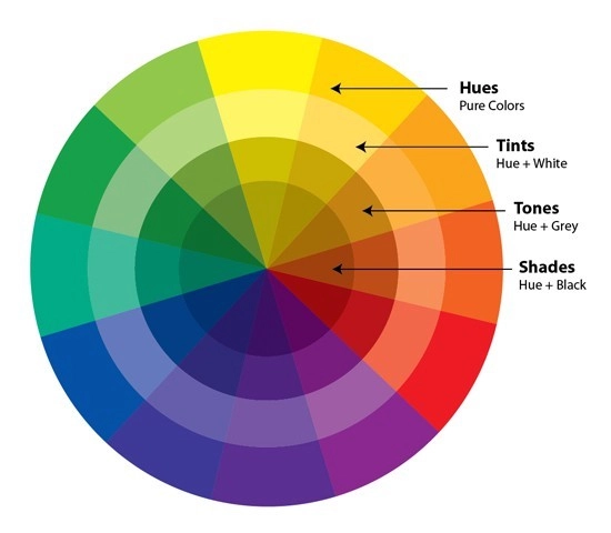
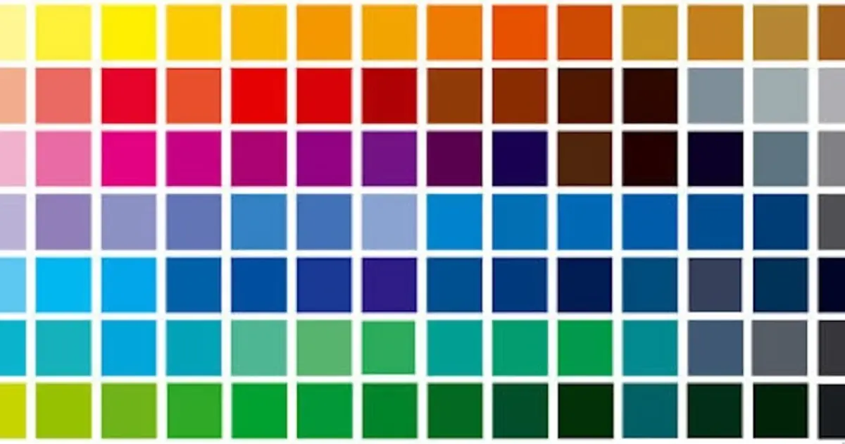
- Refers to the pure, saturated colors shown on the color wheel above.
- Tint is created by adding white to a single hue, making it lighter or less saturated. Tinted colors are often more calming than saturated colors.
- Shade
- Saturation refers to the overall intensity or chroma of a color. A pure hue will be more saturated than its tints or tones.
The Color Psychology behind The Color Tone
Color psychology focuses on the symbolism and meaning of colors, and how colors and their combinations can affect human emotions. The principles of color psychology can be applied in a variety of fields, such as helping marketers effectively build brands or new homeowners choose the right colors for their dining room.
Each color evokes a specific emotional response in the viewer, shaping the consumer’s perception of the overall design of the display. In product development, marketing, and brand promotion, this positive brand awareness can influence consumer purchasing decisions and ultimately improve performance.
Read on to learn about the typical feelings that different colors evoke, and how you can apply specific colors in your designs.

1. Warm Colors
Color tone warm, such as red, orange, and yellow, can stimulate the senses and evoke a sense of joy with their brightness. These colors have rich emotional meanings, but if they are used as the main color of a composition, they can easily be overwhelming. Tints, tones, and shades of warm hues are your best tools, as they help to reduce the saturation of a hue without sacrificing its positive effects.
Warm colors can be used as accent colors, sparingly applied to various brand elements, or combined with cool colors to achieve a harmonious balance.
2. Cool Colors
On the other hand, cooler hues tend to give people a sense of calm and trustworthiness. Blue hues, green hues, purple hues, and even pink hues tend to be more versatile; they can be integrated into brand elements as main colors or accent colors.
Try using complementary colors of cool colors to enhance your composition, or use warm colors to set off cool colors.
Part 3: Realize the Color Tone Adjustments with Evoto AI
Evoto – The Most Efficient AI Photo Editor
In this case, realizing color tone adjustments involve using Evoto’s tools to manipulate the hue, saturation, and lightness of the colors in your image. Evoto offer features like:
- Sliders for adjusting hue, saturation, and lightness.
- Presets designed to achieve specific color tones, including exposure, contrast, highlight, shadow, white, black, vibrance, and saturation).

By understanding color theory and the tools available in Evoto AI, you can effectively adjust color tones and achieve the desired look in your designs or photos.
Evoto – The Most Efficient AI Photo Editor
Conclusion
In conclusion, this comprehensive guide has equipped you with the fundamental knowledge of color tone, color theory, and color psychology. You’ve explored the building blocks of color (hue, saturation, value) and how they are manipulated to create tints, tones, and shades.
Finally, the guide explored how to leverage Evoto AI Photo Editor features to achieve your desired color tone in your photos or designs. By understanding the tools available, you can effectively adjust hue, saturation, and lightness to bring your creative vision to life!

