
Your text looks fine in the editor, but then it vanishes on the photo. That is not a font problem. It is a contrast problem on a busy background. When light and dark pixels sit behind the same line, plain white or plain black fill loses the fight no matter how large you scale the type. Fixing text overlay on image readability means giving letters an edge the scene cannot swallow.
TL;DR
- Root cause: Mixed light and dark backgrounds break single-fill type. Bigger font size alone rarely saves sunset skies, portraits, or neon streets.
- Default fix: Thin contrasting “Stroke” first, then soft “Shadow” if the line still feels flat on the actual photo.
- Test before export: Preview at phone width on the real image, not only in the editor sidebar.
- Shortcut: Evoto “Templates” with stroke and shadow baked in; hand-tune only when the preset still fights the shot.
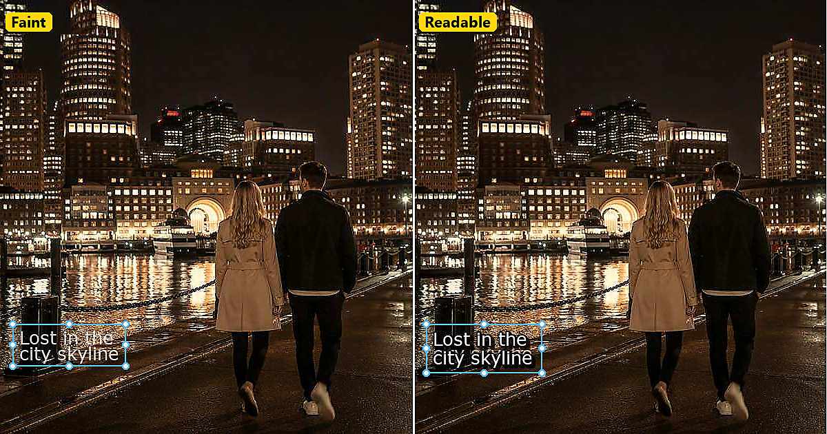
Graphic designers have documented this pattern for years. In a Graphic Design Stack Exchange discussion, Lucas tried light and dark colors on a dusk city photo and found every flat fill felt overpowered by the background until contributors suggested outline, shadow, or local contrast instead of another color guess. The lesson transfers directly to Instagram quote cards and travel captions.
Fix contrast on the real photo. Open Add Text to Image, add your line, then expand “Stroke” and “Shadow” in the “Text” panel. Small moves on the actual background beat guessing white versus black in a blank sidebar.
Why Plain White or Black Text Fails on Photos
A photo is not a solid backdrop. Skies gradient from gold to navy. Faces jump from highlight to shadow in a single word width. Storefronts mix neon, glass, and pavement in one caption zone. When you place overlaid text on that mix, one fill color cannot stay visible everywhere.
This is why text overlay on image tutorials that stop at “pick white for dark photos” fail in the field. The same line crosses both light and dark regions. Scaling up helps until it looks like a billboard on a portrait. You need edge separation, not just size.
Common failure modes worth naming before you touch sliders:
- Sky gradients: White type disappears in bright cloud bands; black type sinks into shadow areas in the same line.
- Portraits: Type crosses skin highlights, hair, and bokeh in one phrase, so neither white nor black wins across the full width.
- Streets and nightlife: Neon, wet pavement, and signage create false edges that flicker as viewers scroll past your photo with text overlay.
Ken Bellows summarized the classic static-image rule in another Stack Exchange answer: white type with a black outline reads on almost any color. Video editors borrowed the same trick for moving frames. Your still photo deserves the same respect.


Powerful AI Photo Editor
Three Background Types That Break Text Overlay on Image Readability
Grouping backgrounds by behavior speeds up fixes. You are not memorizing hex codes. You are choosing “Stroke” weight and “Shadow” depth based on what sits behind the letters.
Skies and Sunsets
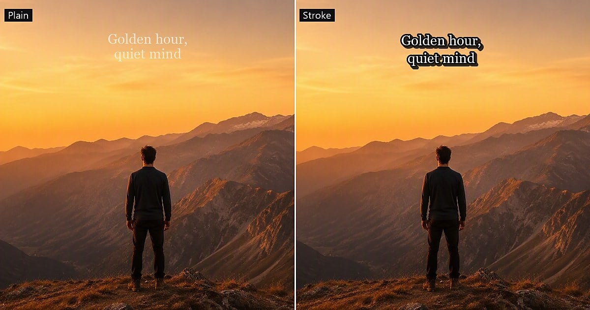
Golden hour looks gentle in the viewfinder and brutal behind sans-serif caps. Bright cloud patches eat white type. Deep blue bands swallow black type in the same caption. Place longer lines in the lower third when open sky sits behind them, and add a thin contrasting stroke so the eye gets a consistent edge even when the fill crosses light and dark zones.
Watch sunset gradients especially: the top of a letter may sit on navy while the bottom sits on gold. That is the classic case where background image with text overlay guides fail if they only say “use white type.”
Portraits and Skin Tones
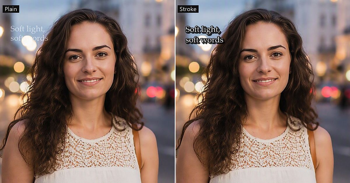
Portrait posts often place a quote across shoulder, cheek, and bokeh at once. Heavy “Stroke” reads harsh on skin and can look sticker-like across an eye line. Prefer lighter stroke weight, softer “Shadow”, and shorter copy. Move type to steadier background areas (open sky, dark bokeh, or a plain wall) when the face should stay unobstructed.
If the quote must sit near skin, test at thumbnail size more aggressively than you would on a landscape frame. Faces draw attention first; unreadable type disappears even faster beside them.
Streets and Nightlife
City frames add high-frequency detail: signs, headlights, wet pavement, and glass reflections. “Shadow” helps here because it lifts overlaid text off texture without a thick cartoon outline. Keep shadow opacity modest and offset slightly downward so letters separate from horizontal noise. Medium stroke plus low shadow often beats a heavy glow that halos around every neon edge.
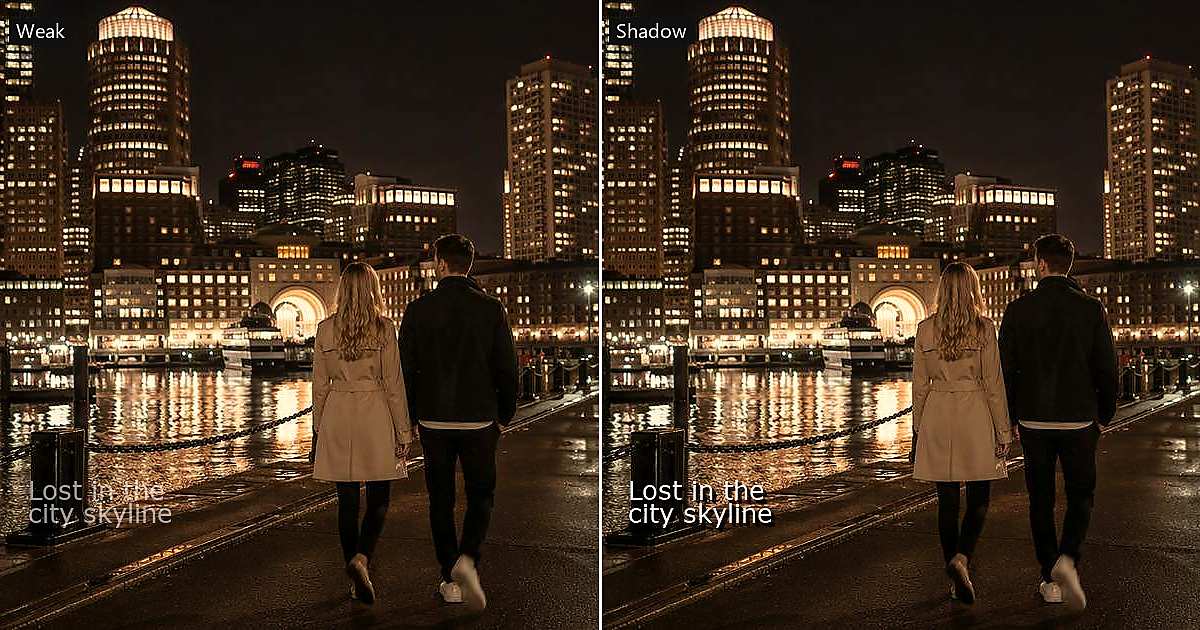
Each category shares one rule for a text overlay on image: judge readability on the photo, not on the checkerboard around the text box.
The Fix: Thin Stroke Plus Soft Shadow for Text Overlay on Image
The prescription is simpler than a design degree sounds. Add separation in two passes on the real photo, not on a blank gray sidebar. This is the practical path without rewriting your caption.
Go to Evoto’s Add Text to Image page and follow the steps below:
Step 1. Apply a Thin Stroke First
Open “Stroke” in Evoto’s “Text” panel and increase width slowly until the edge reads at thumbnail size. White type with a dark stroke (or black type with a light stroke) remains the safest default on mixed backgrounds. Stop when the outline helps; a heavy stroke reads sticker-like on portraits.
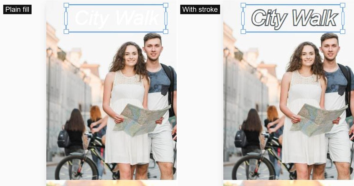
Contributors on a related overlay text thread compared stroke, glow, and semi-transparent blocks. “Stroke” usually wins when you still want the background visible. Solid boxes help minimalist quote cards, but they hide the photo you worked to share.
Step 2. Add Soft Shadow Second
Open “Shadow” with low opacity and a small offset, usually slightly downward. Shadow lifts overlaid text off pavement texture, foliage, and neon without a gray slab behind the whole phrase. If the line still feels flat, nudge “Shadow” before you rewrite the caption.
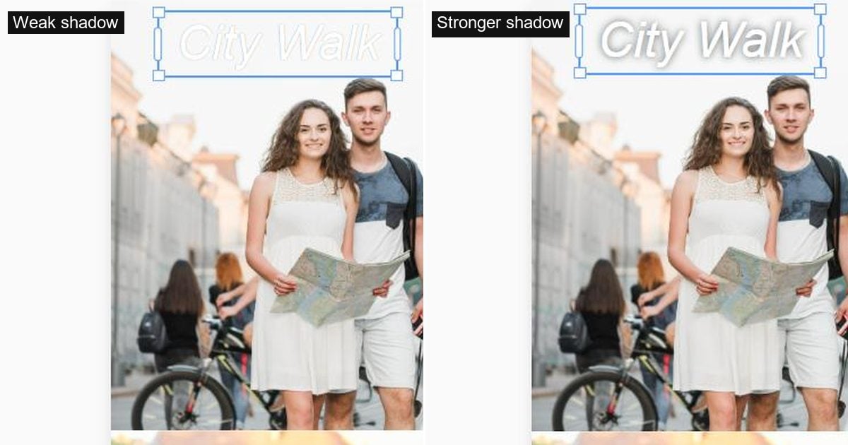
White type with a dark “Stroke” and light “Shadow” remains the safest default on mixed backgrounds. Black type with a light stroke works on bright beach and snow scenes. Swap only after a thumbnail test, not before. The habit matters more than the click order: adjust on the real image, zoom out to phone width, adjust again.
Powerful AI Photo Editor
Quick Presets by Scene (Copy These Starting Points)
The numbers below are starting points for experimentation, not official product specs. Your photo may need one notch lighter or darker.
| Scene | Plain Fill Alone | Stroke + Shadow Starting Point |
|---|---|---|
| Sky/sunset | Often fails mid-gradient | Light fill + thin dark “Stroke” + soft “Shadow” below |
| Portrait | Competes with skin tones | Shorter line + lighter “Stroke” + very soft “Shadow” |
| Street/night | Lost in neon detail | Medium “Stroke” + low-opacity “Shadow” offset down |
Read the table, then test on your file. If plain fill already works on a studio gray backdrop, you may not need stroke at all. The problem this guide solves is the photo with text overlay on real-world clutter, not a flat brand color.
Swapping to a cleaner background does not always remove the need for stroke. Even after a backdrop change, edges along hair or horizon lines can still flicker. A light “Stroke” stabilizes the word shape. If you are exploring backdrop swaps separately, the make background transparent guide covers cutout workflows without repeating them here.
Check Text Overlay on Image Readability Before You Export
How to make text readable on an image at export time is a short QC pass, not a design ritual:
- Shrink to feed width. If the phrase becomes a smear, “Stroke” is still too light or the line is too long for the background.
- Check intentional coverage. Confirm you mean to cover faces, logos, or candles before you publish over them.
- Compare plain vs stroke+shadow. Toggle “Stroke” off once. If readability collapses, you found the real fix; font size was never the bottleneck.
- Export JPEG only after the thumbnail test passes. Reopening and re-saving through multiple apps softens fine type edges.
This pass assumes the caption is already on the photo. If you still need upload and “Text” panel steps, the companion add-text guide covers Web, iPhone, and Markup paths without repeating them here.
Read More: Insta Post Caption Ideas: Quotes for Photos
When a Template Already Handles Contrast
Evoto “Templates” often ship with “Stroke” and “Shadow” baked in. Apply the template first, type your caption, and touch stroke only if a specific background still fights the defaults. That order saves time on travel grids where you repeat one look across nine frames.
Templates are not magic on every skyline, but they encode sensible defaults learned from repeated caption layouts. Manual stroke tuning remains the fallback when the photo is louder than the preset.
Download Evoto and find more useful photo editing tools:
Powerful AI Photo Editor
Bottom Line: Make Every Text Overlay on Image Readable at Feed Size
Readable text overlay on image work is separation plus preview. “Stroke” gives the eye an edge. “Shadow” separates letters from texture. “Templates” encode sensible defaults when you batch similar posts. Thumbnail testing catches failures the full-size canvas hides, especially on skies, skin, and street clutter.
If the words are not on the photo yet, start with platform steps on how to add text to a photo. If the line exists and still vanishes, tune “Stroke” and “Shadow” on the shot itself before you rewrite the caption.
Make the words stick. Style your caption in Add Text to Image, tune “Stroke” and “Shadow” on the busy shot itself, and export when the line survives a phone-width glance.
FAQ
1. What Is the Difference Between a Text Overlay and Readable Caption Type?
A text overlay on image is any type placed on a photo. Readable caption type still reads at feed size on mixed backgrounds. Overlays fail when contrast disappears; readable type keeps a visible edge through “Stroke”, “Shadow”, or template defaults.
2. Should I Use White or Black Text on a Busy Photo?
Start with white fill and a dark “Stroke” if the scene mixes light and dark. Use black fill and a light stroke on bright snow, sand, or white walls. Always confirm with a phone-width preview instead of trusting a single color rule.
3. How Do I Make Text Readable on Image Without a Design Degree?
Add a thin “Stroke”, add a soft “Shadow”, shorten the line, and test small. You do not need manual curves or blend modes for everyday Instagram posts. Adjust on the actual photo until the phrase survives a thumbnail glance.
4. Does Stroke Look Cheap on Portrait Posts?
Heavy “Stroke” looks sticker-like. Light stroke with soft “Shadow” usually feels photographic. Keep lines short and place type on steadier background areas when you can, such as open sky or soft bokeh, not across an eye.
5. How Is This Different From Editing Text Already Baked Into an Image (OCR)?
OCR tools try to detect and replace existing type in a flat scan or meme. This guide covers new caption type you place on a photo in an editor like Evoto. If you need to change sign text in a screenshot, that is a different workflow entirely.
6. Does Evoto Use My Photos to Train AI Generative Models?
No. Evoto never uses Your Content to train AI generative models without your explicit, proactive, opt-in consent. Running the features you request is not the same as using your uploads for general model training. See Evoto’s Privacy Policy for the current wording.
7. Can I Fix Readability on iPhone Before Posting to Instagram?
Yes. Evoto App exposes the same “Stroke” and “Shadow” controls in the “Text” panel. Apply a “Templates” thumbnail, type your line, tune stroke at phone width, then export “JPEG” and upload to Instagram.