

Creating an Instagram profile grid starts with one complete image. Design it at the proportions of your chosen layout. After that, you split a photo for Instagram into equal square tiles.
Label the files clearly. Publish them in reverse order. The finished grid should read as one composition, not disconnected posts.

Start With the Grid You Want
An Instagram grid splitter helps when one visual needs more room than a single feed post. Typical uses include a campaign image, editorial portrait, event announcement, lookbook cover, or panoramic scene.
Decide how long the grid should live on your profile before you crop. A launch moment can sit at the top for a few days. New posts will push the tiles down. The design should still make sense after it leaves the top row.
A wedding studio might use a 3-by-3 portrait for an announcement week. A commercial photographer might use a 3-by-1 banner for a seasonal rebrand. Choose the job first. Then choose the layout.


Powerful AI Photo Editor
Choose a Layout Before You Split
The layout determines the shape of the master canvas. A 3-by-1 layout is a wide banner across one row. A 3-by-2 layout creates a short editorial spread. A 3-by-3 layout gives you the most storytelling space. It also requires nine separate posts.
For most photographers, save a 3-by-3 grid for a strong sequence. Use it when the image is worth temporarily dominating the profile.
| Layout | Best use | Planning note |
|---|---|---|
| 3 by 1 | Panoramas, headlines, simple campaign banners | Keep the main subject away from the two vertical seams. |
| 3 by 2 | Editorial diptychs, product launches, short stories | Works well when the focal point can span multiple tiles. |
| 3 by 3 | Major announcements, visual narratives, portfolio moments | Requires nine posts and careful reverse-order publishing. |
How to Split a Photo for Instagram Into Tiles
Finish the master image first. Then cut it in Evoto Image Splitter. Upload the photo, choose a layout, and export a zip of equal tiles.
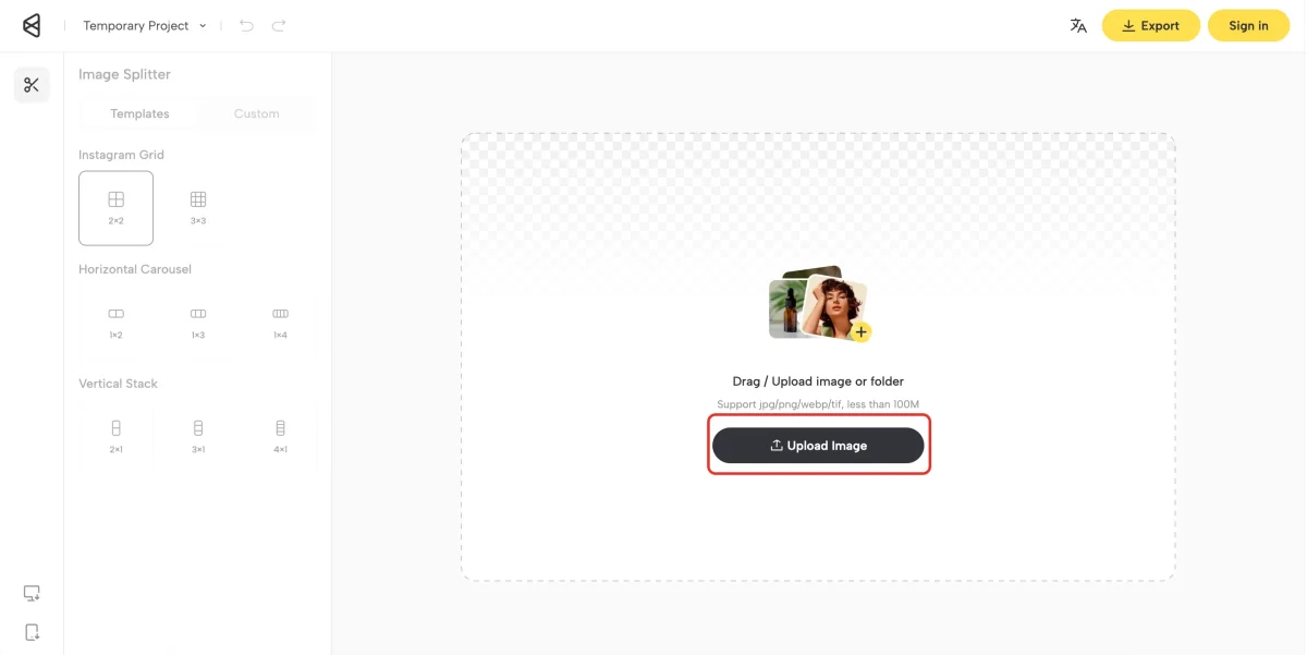
Step 1: Upload the Master Image
Open Image Splitter and upload the finished JPEG or PNG. The canvas shows the full photo. For a 3×3 profile grid, a 3240-by-3240-pixel master keeps each tile at 1080 pixels. If the file is smaller, enhance the photo before you split it so the tiles stay sharp.
Step 2: Choose Templates or Custom
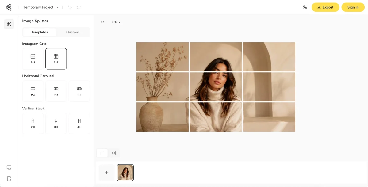
Use Templates for a preset. Switch to Custom if you need another row and column count.
For a profile grid, open Instagram Grid and select 3×3. Use 2×2 when you only need four squares.
For a one-row banner, use Horizontal Carousel. Choose 1×2, 1×3, or 1×4. A 3-by-1 layout in this article is 1×3. For a one-column stack, use Vertical Stack and choose 2×1, 3×1, or 4×1. A 3-by-2 spread is not a preset. Set it in Custom.
Step 3: Check the Cut Lines
The preview draws the seams on the photo. Confirm the face sits inside one tile. Keep logos and essential text off the lines. If a seam hits a key detail, change the template or use Custom.
Step 4: Export the Zip
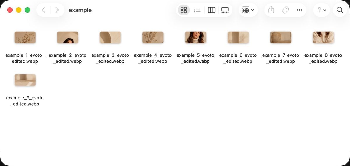
Click Export and download the zip. Unzip the folder and confirm the tile count matches the layout. Then save the files.
Step 5: Label and Publish in Reverse
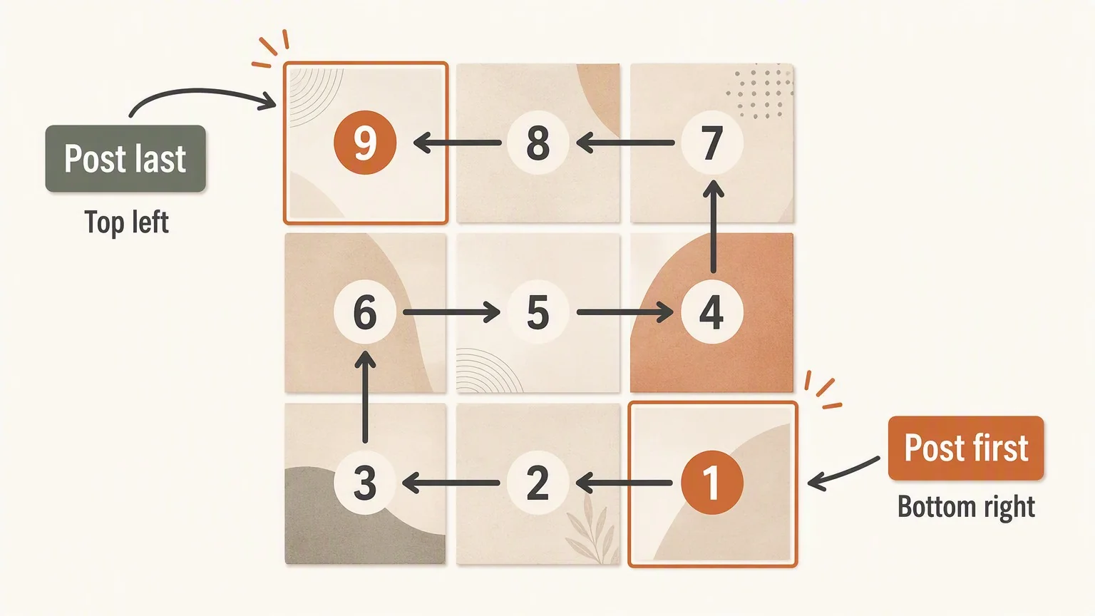
Label the tiles by position. Publish from bottom right to top left. Check your profile grid after each upload.
A simple way to remember the order: build the image as viewers should see it. Then publish it backward. In a three-column profile, the last tile in the composition is posted first. The first tile is posted last.
Design Around Seams, Not Just the Center
A grid split succeeds when each tile works on its own and the whole design works together. The seams are the visual challenge. A face cut down the middle looks accidental. A horizon that jumps at a seam does too. Tiny text broken across tiles is worse.
- Place a portrait subject primarily inside one tile, then let clothing, background, or negative space cross into adjacent tiles.
- Use broad color fields, skies, walls, fabric, foliage, or gradual shadows across seams; these elements join more naturally than sharp details.
- Treat every vertical and horizontal seam as a potential interruption. Zoom in and inspect each one before you click Export.
- Keep essential copy within a single tile whenever possible. If text must span tiles, make it large, minimal, and not required to understand the post.
- Preview the image with visible guides, then preview the cropped tiles side by side before posting.
Common Instagram Grid Splitter Mistakes
- Posting left to right instead of in reverse order. The grid will assemble backward. Fixing it may mean deleting and reposting.
- Using a canvas that does not divide evenly. Unequal tiles can misalign or crop inconsistently.
- Making individual posts look unfinished. Not every tile needs a complete photo. Each one should still look deliberate in the feed.
- Putting critical information on an edge or seam. A viewer may see only one tile in their home feed. Context should not depend on the full grid.
- Forgetting how quickly a grid changes. Plan follow-up posts so they do not break the top of your profile.
Final Checklist Before You Publish
- The master canvas matches the number of rows and columns you chose.
- Every tile is square and exported at the same dimensions.
- Faces, text, and key details avoid seams whenever possible.
- Global retouching and color work were completed before splitting.
- Files are labeled in a way that makes reverse posting obvious.
- You have reviewed the full grid preview and each tile as an individual post.
- You have a plan for the next posts that will move the grid down your profile.
Before a major campaign, post a test grid with placeholders or duplicate images. That preview catches ordering, seam, and crop issues. Check it on your phone, not only on a desktop browser. Instagram can change how the profile grid displays. Check the final sequence on your own profile before it goes live.
If you later split a photo for Instagram again, keep the same canvas math. Keep the same reverse-posting order. The method stays stable even when the image changes.
Powerful AI Photo Editor