
Choosing between a text watermark and a logo watermark sounds like a small branding decision. It can have a noticeable effect on how people experience your photos. The wrong mark may be unreadable on mobile, disappear after cropping, or compete with a carefully edited composition. The right one identifies your work, looks professional, and supports your business without becoming the subject.
Text and logo watermarks both have a place in a photographer’s workflow. The best choice depends on how recognizable your brand is, where the image will appear, how much information viewers need, and how quickly you must prepare a batch of files. Here is a practical comparison for portraits, weddings, products, real estate, and social media.
Text watermark: clear and flexible
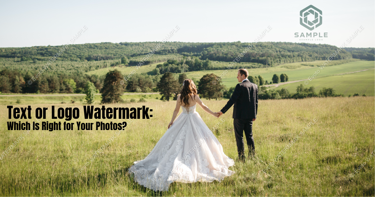
A text watermark uses a name, business name, website, or social handle. Its biggest advantage is immediate readability. Someone who sees a photo on Pinterest, Instagram, or a blog can understand who made it without recognizing a symbol first.
Text is also flexible. You can change the wording for a campaign, add a short URL, or create light and dark versions without reopening a logo file. It is easy to scale, works with a wide range of images, and can be prepared quickly when you are testing a new brand name.
The downside is that text can feel generic or visually heavy. A long business name becomes tiny at low opacity or takes up too much space at a readable size. Decorative fonts may look elegant in a large proof but become illegible after social compression. Keep the wording short, choose a legible typeface, and check it on a phone.
Logo watermark: strong visual identity
A logo watermark uses a symbol, wordmark, or combined mark from your brand identity. It can make a photo feel polished and consistent across a portfolio, campaign, or client gallery. Once people recognize the logo, it communicates ownership quickly without adding a line of text to the composition.
Logos are especially useful for established studios, agencies, e-commerce brands, and teams with a recognizable visual system. They can also be more compact than a full business name. A transparent PNG or vector-based source lets you preserve clean edges while changing size and opacity.
The challenge is recognition. An unfamiliar symbol tells a new viewer very little, and a detailed logo may turn into a blurry blob when exported small. Prepare a simplified version for small images, maintain the logo’s proportions, and use enough contrast for the shape to remain identifiable.
Text vs. logo: a quick comparison
| Consideration | Text watermark | Logo watermark |
|---|---|---|
| Immediate attribution | Excellent | Depends on recognition |
| Brand polish | Clean when designed well | Strong for established brands |
| Flexibility | Easy to edit and localize | Consistent across campaigns |
| Small mobile exports | Usually readable | Can lose fine detail |
| Long-term branding | Builds name recall | Builds symbol recall |
| Setup | Very fast | Requires a quality asset |
Neither option is automatically more secure. A watermark’s deterrent value comes from visibility, placement, and how difficult it is to remove without damaging the image—not from whether it contains words or a symbol.
When a text watermark is the better choice
Use text when you are building name recognition or sharing work with an audience that may not know your logo. A photographer’s name and website can turn an unattributed repost into a discoverable lead. Text is also practical for collaborations, temporary campaigns, and marketplaces where a handle or business name matters more than a decorative mark.
Choose a short phrase. “Jane Smith Photography” may be enough; a full sentence with phone number, email, and address is not. Use a clean font, modest letter spacing, and a size that remains readable at normal display size. If the image is busy, add a subtle outline or shadow rather than increasing opacity dramatically.


Powerful AI Photo Editor
When a logo watermark is the better choice
Use a logo when your brand is established and the visual identity is already familiar. A logo can be elegant on wedding galleries, editorial work, and premium product imagery where a large line of text would distract. It is also a good option for a consistent series of images created by a studio or in-house team.
Keep alternate logo assets ready: light, dark, horizontal, stacked, and simplified. A complex emblem with thin lines may look excellent on a large print but fail on a 1080-pixel social post. Test the smallest intended export before approving a design.
A hybrid watermark can offer the best of both
You do not have to choose one format forever. A small logo paired with a short website or handle can deliver both recognition and clarity. Use the combination for public previews or campaigns where attribution is important. Keep it compact and give the elements enough spacing that they read as one intentional lockup.
For a proof, you might use a larger logo with a short URL. For a final licensed image, you may remove the visible mark and rely on copyright metadata or delivery terms. Separate export presets keep those decisions clear and prevent accidental misuse of a preview file.
Design rules that protect the photo
Whichever format you choose, simplicity wins. Limit colors, avoid overly thin details, and maintain the original proportions of a logo. Set opacity based on the specific background instead of using a single number for every image. Place the mark away from faces, product labels, and key storytelling details.
Edit the photo first, then add the watermark as the final layer. Review both a 100% view and the way the image appears in its destination. Social platforms may crop or compress the file, changing how the mark looks. Prepare presets for landscape, square, and vertical formats rather than forcing one placement onto every composition.
Build a consistent workflow with Evoto
Watermark choice is only one part of delivering professional images. You may also need color consistency, skin retouching, background cleanup, and batch processing. Evoto gives photographers and visual teams an AI-assisted editing environment for those tasks, helping them finish a coherent set before creating branded exports.
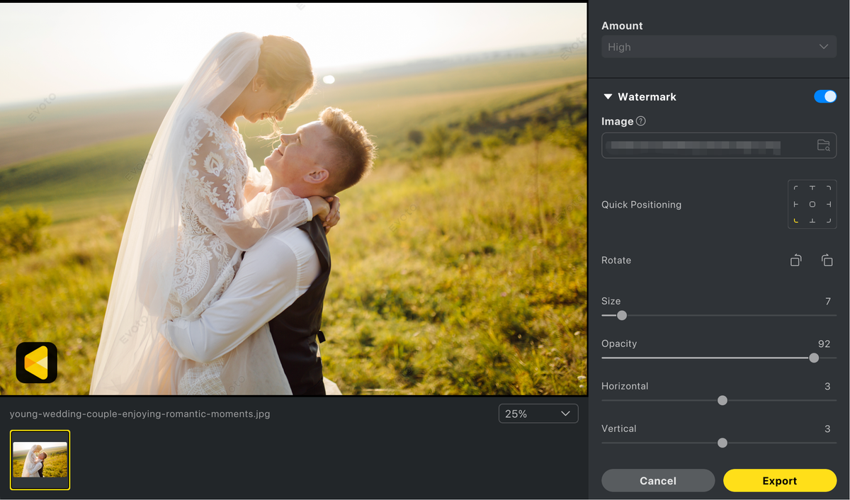
For example, complete your base adjustments and retouching, synchronize the look across the gallery, and then export a text, logo, or hybrid watermark preset for the intended channel. Keeping editing and delivery decisions organized reduces repetitive work and makes it easier to maintain the same brand standard from the first image to the last.
Match the watermark to the audience and channel
For Instagram, TikTok, and Pinterest, readability on a phone matters most. A short text mark or simplified logo usually beats a detailed lockup. For a website portfolio, a tasteful logo can support a premium presentation. For client proofs, a more visible hybrid or repeated mark may be appropriate because the file is not the final licensed asset.
Product sellers should prioritize clarity: never cover a product name, model number, or important feature. Real-estate photographers can use a discreet text or logo mark in the lower third, while event photographers often benefit from a recognizable studio logo that does not cover guests’ faces.
Text and logo watermark FAQ
Is a logo watermark more professional than text?
Not automatically. A clear, well-spaced text mark can look more professional than a low-resolution or overly detailed logo. Design quality and placement matter more than the format.
Is text easier to remove than a logo?
Both can be cropped or digitally removed. A watermark placed over a meaningful but nonessential area is generally harder to erase cleanly than one sitting in an empty corner.
Should my watermark include my website?
A short website or social handle is useful when discoverability is a goal. Keep it brief enough to remain readable, and test the result on mobile exports.
Can I change from text to a logo later?
Yes. Keep your original photos unwatermarked and save separate export presets. This lets you update branding without re-editing or degrading the master files.
The decision in one sentence
Choose text when immediate attribution and flexibility matter most; choose a logo when visual brand recognition and a polished look are stronger priorities. Use a hybrid when you need both. Whatever you select, keep it simple, protect the composition, and review the final export in context. With Evoto supporting the editing and batch workflow behind the scenes, your watermark can reinforce the brand while the photograph remains the reason people stop scrolling.
Powerful AI Photo Editor