
Have you ever taken what you thought would be an amazing photo, only to find it looks flat, muted, and… well, dull? You’re not alone. This is the #1 complaint we hear from photographers. The good news? It’s incredibly easy to fix.
In this guide, you’ll discover the three main reasons your photos lack that “wow” factor and learn five simple techniques to transform them into vibrant, professional-looking images in five minutes or less.
Why Your Photos Look Dull: The 3 Main Culprits
Before we fix the problem, let’s understand what causes it.
1. Flat Lighting Conditions
Overcast days, harsh midday sun, or indoor lighting can create minimal contrast, making colors appear muted and lifeless.
2. Incorrect Camera Settings
Underexposing your images or using the wrong white balance can strip the richness from colors before you even start editing.
3. Default Camera Processing
Your camera’s built-in processing often plays it safe, producing natural but unexciting colors that lack the pop we see with our eyes.
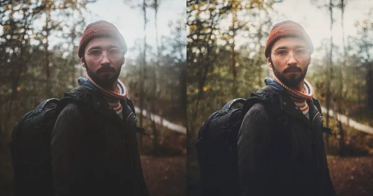
The 5-Minute Color Transformation: Professional Techniques Made Simple
Time needed: 5 minutes
Step 1: Nail the Exposure (1 minute)
The Problem: Underexposed images hide color vibrancy.
The Fix: Increase exposure until the image looks bright but not washed out. Pay attention to preserving highlight details.
Pro Tip: Use the histogram in your editing software. Aim for the data to be weighted toward the right without touching the edge.
Step 2: Boost Contrast & Dehaze (1 minute)
The Problem: Flat images lack separation between colors.
The Fix:
- Increase Contrast to make dark areas darker and light areas lighter
- Use Dehaze to cut through atmospheric dullness and add depth
Step 3: Master Saturation vs. Vibrance (1 minute)
The Problem: Over-saturating creates unnatural, cartoonish colors.
The Fix:
- Use Vibrance for intelligent saturation boost (affects muted colors most)
- Use Saturation sparingly for global color intensity
Step 4: Targeted Color Adjustments (1.5 minutes)
The Problem: Some colors need more help than others.
The Fix: Use HSL (Hue, Saturation, Luminance) sliders to:
- Increase saturation on primary colors (blues, reds, greens)
- Reduce luminance on key colors to make them richer
- Adjust hues to get the exact color tone you want
Step 5: Color Grading for Mood (0.5 minutes)
The Problem: Images lack cohesive color mood.
The Fix: Add subtle warmth to highlights and cool tones to shadows for professional color separation that makes images “pop.”
The Secret Weapon: Let AI Do the Heavy Lifting
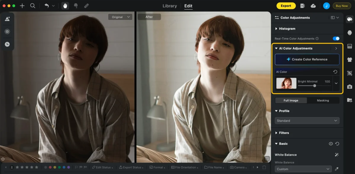
While you can absolutely follow the steps above manually, what if you could achieve professional color grading in one click?
This is where AI photo editors like Evoto AI revolutionize the process. Instead of spending minutes on each slider:
- Auto Color Correction: Evoto’s AI analyzes your image and applies perfect exposure, contrast, and color balance automatically
- Intelligent Vibrance Boost: The AI knows which colors to boost and by how much for natural-looking vibrancy
- One-Click Color Styles: Choose from professionally designed color presets that would take hours to recreate manually
From dull to vibrant in one click with Evoto’s AI Color Enhancement Now


Powerful AI Photo Editor
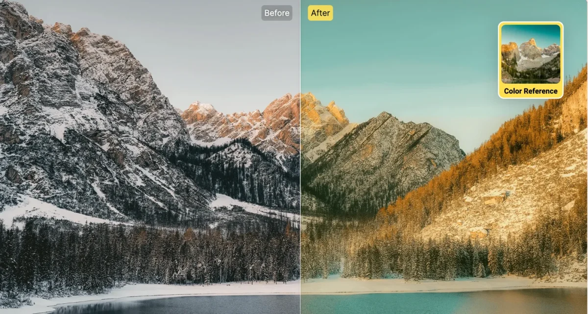
Real-World Example: Transforming a Dull Landscape
Let’s look at a common scenario: a landscape photo taken on an overcast day.
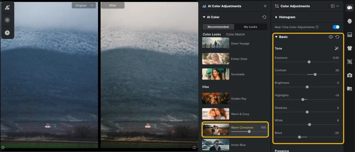
The Original: Flat lighting, muted greens and blues, lacking depth
Manual Editing (3 minutes): Following our 5-step process to decent results
Evoto AI (15 seconds): One-click “Natural Vibrance” preset for professional-grade color
The result? The AI not only matched the manual edits but actually improved upon them with more nuanced color handling that would take most photographers years to master.
Quick Color Fixes for Common Scenarios
- Portraits: Boost reds and oranges for healthy skin tones, add cool tones to shadows
- Landscapes: Enhance greens and blues, use dehaze for atmospheric depth
- Food Photography: Boost yellows and reds, increase overall vibrance for appetite appeal
- Urban Photography: Enhance neutral tones and primary colors for gritty vibrancy
Your 5-Minute Color Workflow Checklist
For those who want a quick reference, here’s your go-to checklist:
- Adjust exposure for optimal brightness
- Boost contrast and dehaze for depth
- Use Vibrance for intelligent saturation
- Fine-tune specific colors with HSL sliders
- Add subtle color grading for mood
- Bonus: Try Evoto’s AI Color Match for instant professional results
Ready to Transform Your Dull Photos?
The journey from dull, flat images to vibrant, eye-catching photos is simpler than you think. Whether you choose to master the manual techniques or leverage AI tools like Evoto AI, you now have the knowledge to create colors that pop.
The best part? You can try these techniques right now. Download your free trial of Evoto AI and experience one-click color transformation for yourself. Your dull photo days are officially over!
FAQs
Q: Why do professional photographers’ colors look better than mine?
A: Pros almost always edit their photos. It’s not about better cameras—it’s about better editing techniques and tools.
Q: How much color editing is too much?
A: A good rule: stop when the colors look vibrant but still natural. If it looks like a cartoon, you’ve gone too far.
Q: What’s the fastest way to get consistent colors across multiple photos?
A: Use presets or batch editing. Evoto’s AI can apply the same color grading to hundreds of photos simultaneously, ensuring perfect consistency.