

Pause almost any memorable film on a single frame and the color is already telling you how to feel. A cold blue corridor reads as lonely before a word is spoken; a golden, sun-warmed kitchen feels safe and nostalgic. That emotional layer is not an accident — it is the result of color grading in movies, the deliberate shaping of color after the camera stops rolling. This guide breaks down how films use color to tell stories, the signature looks you have seen a hundred times without naming them, and how you can bring the same cinematic feeling to your own footage.
What is color grading in movies?
Color grading is the creative process of adjusting the colors and tones of footage to build a specific mood, style, or visual identity. It is the final coat of paint on a film’s look, and it is distinct from color correction. Correction is the technical step first: balancing exposure, fixing white balance, and matching shots so the footage looks neutral and consistent. Film color grading is what happens next — the artistic decisions that push that neutral image toward a feeling.

The craft has deep roots. In the photochemical era, the look was set during “color timing,” when a technician adjusted the printer lights that exposed the film stock. Today that role belongs to the colorist, who works digitally with far more precision and freedom. The goal, however, has never changed: use color to support the story. When people talk about color grading in films, they are really talking about this marriage of technology and storytelling intent.
How films use color to tell stories
Once you know what to look for, cinematic color grading is everywhere. Directors and colorists lean on a handful of reliable principles to steer your emotions, often without you noticing.
Warm vs cool: setting the emotional temperature
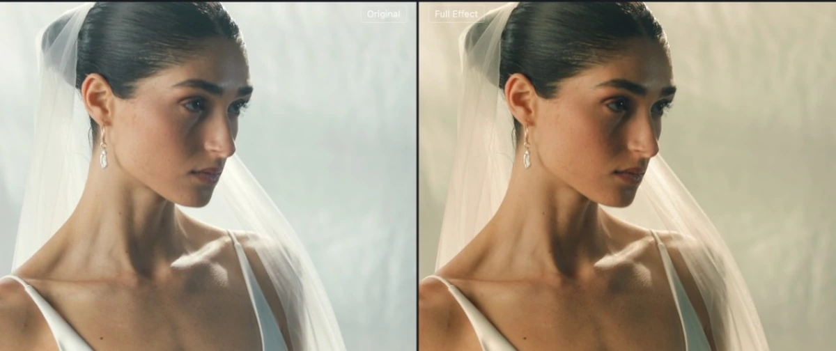
The most fundamental tool is color temperature. Warm tones — oranges, golds, ambers — suggest comfort, intimacy, energy, or nostalgia. Cool tones — blues, teals, greens — signal isolation, tension, calm, or unease. A flashback might glow warm and hazy, while a sterile hospital scene turns clinical blue. The shift is doing narrative work, telling you where and how to feel without a line of dialogue.
Teal and orange: the modern blockbuster look
If one look defines modern movie color grading, it is teal and orange. Human skin sits in the orange range, so pushing shadows and backgrounds toward teal makes actors pop against the frame. The complementary contrast feels rich, expensive, and dynamic — which is exactly why action films and blockbusters reach for it again and again. Once you spot it, you cannot unsee it.
Single-color worlds
Some films commit to a dominant hue to define an entire world. The sickly green of The Matrix marks the simulated reality; the scorched orange deserts and deep teal nights of Mad Max: Fury Road make the wasteland feel relentless and otherworldly. A single, consistent palette turns color into world-building.
Color as a character arc
Color can also evolve across a story. A film may begin in muted, desaturated tones and slowly bloom into vivid color as a character comes alive — or drain of color as hope fades. Tracking how a palette changes from the first act to the last is one of the clearest examples of color carrying the emotional arc.
Evoto Video – Be the First to Edit Smarter
Professional-grade AI color grading and retouching for video creators.
Iconic examples of color grading in movies
A few filmmakers have made color so central to their style that their work is instantly recognizable.
Wes Anderson: symmetrical pastels
No discussion of cinematic color is complete without Wes Anderson. His films lean on meticulously controlled pastel palettes — buttery yellows, soft pinks, faded reds — paired with symmetrical framing. The result is storybook, nostalgic, and unmistakably his. Wes Anderson color grading is so distinctive that “make it look like a Wes Anderson film” has become its own shorthand.
Blade Runner 2049 and Amélie
Blade Runner 2049 uses bold, saturated blocks of color — amber dust storms, icy blues, deep reds — to make each location its own emotional zone. Amélie, by contrast, pushes warm greens and saturated reds to wrap Paris in a cozy, fairy-tale glow. Different goals, same principle: a committed palette that supports the story’s tone.
Meet Evoto Video: bring a cinematic grade to your own footage
Evoto Video is an AI video editor built to make color and portrait work fast. Its color tool, AI Color Match, is reference-based: instead of balancing wheels, curves, and scopes, you hand it one look — a built-in style or a still you upload — and it transfers that color onto your footage automatically. That makes the cinematic looks described above approachable for anyone, not just professional colorists. Want a teal and orange blockbuster feel, or the palette of a favorite film? Point Evoto Video at a reference and it does the matching for you.
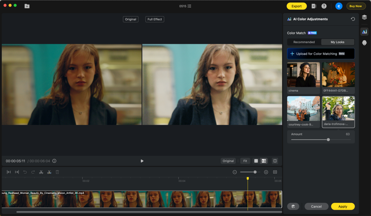
Because it is look-transfer based rather than a manual grading desk, the only control you steer is how strongly the look is applied. You can also retouch your subjects in the same tool — skin, blemishes, and reshape tracked automatically across frames — so a clip is finished without bouncing between apps.
How to apply a cinematic color grade in Evoto Video
Recreating a film-inspired look takes only a few clicks.
Evoto Video – Be the First to Edit Smarter
Professional-grade AI color grading and retouching for video creators.
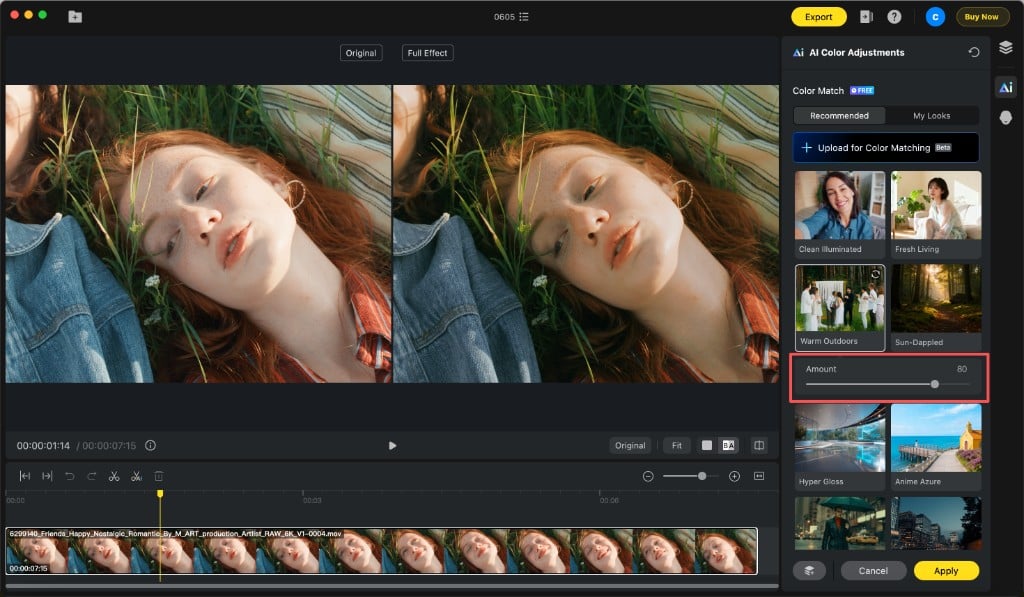
Step 1: Open AI Color Adjustments and pick a reference
Open the AI Color Adjustments panel from the palette icon in the right toolbar and find the Color Match section. On the Recommended tab, choose a ready-made look such as Teal & Orange, Cobalt Night, or Sun-Dappled for an instant cinematic direction.
Step 2: Or upload a film still in My Looks
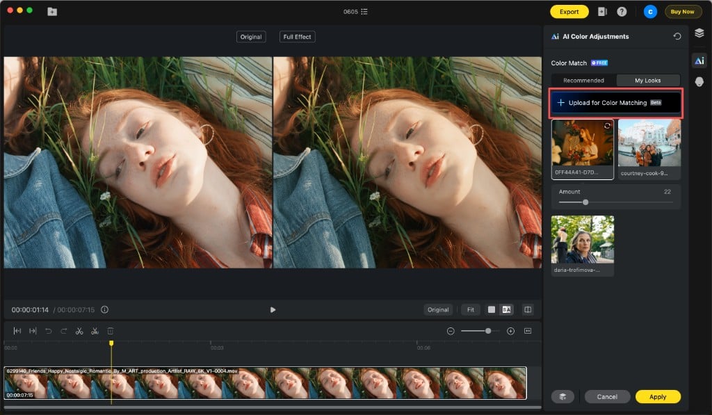
To chase a specific movie’s palette, switch to the My Looks tab, click Upload for Color Matching, and import a PNG or JPG — a frame from the film whose look you admire. Evoto Video analyzes the reference and maps its color onto your clip.
Step 3: Dial the Amount, then Apply and save
Once a look is selected, an Amount slider appears. Drag it to control how strongly the grade is applied — a moderate value keeps things natural, a higher value pushes the cinematic feel harder. Preview on a single frame, click Apply to render it across the whole clip, then Save Preset so you can reuse the same look on every other shot.
Conclusion
Color is one of cinema’s most powerful storytelling tools, working on your emotions long before you consciously notice it. Understanding color grading in movies — warm versus cool, teal and orange, signature palettes, and color that evolves with the story — changes how you watch films and how you shoot your own. And with a reference-based tool like Evoto Video, bringing that cinematic feeling to your footage no longer requires a colorist’s desk. Download Evoto Video and try matching your next clip to the look of a film you love.
FAQ
What is the difference between color grading and color correction in film?
Color correction is the technical first step — balancing exposure, white balance, and matching shots so footage looks neutral and consistent. Film color grading comes after, applying creative color choices to build mood and style. Correction fixes the image; grading gives it a feeling.
Why is teal and orange so common in movies?
Skin tones fall in the orange range, so pushing the rest of the frame toward teal makes actors stand out through complementary contrast. The look feels vivid and high-budget, which is why action films and blockbusters use it so often.
Can I recreate a specific movie’s color grade on my own footage?
You can get very close. In Evoto Video, upload a still from the film as a reference under My Looks, and AI Color Match maps that palette onto your clip. Adjust the Amount slider to taste and save it as a preset for the rest of your shots.