

Some photos feel calm the second you see them. Others feel crowded, tilted, or heavy on one side even when the subject is strong.
That usually comes down to balance.
Balance in photography composition is not about making both sides of the frame identical. It is about arranging visual weight so the image feels intentional. Sometimes that means calm symmetry. Sometimes it means a small subject held by a large area of negative space. Sometimes it means using color, light, shadow, or texture to keep the viewer’s eye moving through the frame without getting stuck in the wrong place.
For working photographers, balance is practical. It helps you decide where to place the subject, how much space to leave, what to include at the edges, and what to clean up later. It also helps you know when a photo feels unfinished, even if the exposure and focus are technically correct.
What Is Balance in Photography Composition?
Balance in photography composition is the way visual weight is distributed inside a frame.
Visual weight is anything that pulls attention. A face carries weight. A bright highlight carries weight. So does a bold color, a dark shape, a sharp texture, a large object, a high-contrast edge, or an empty area that gives the subject space.
When those elements feel intentionally arranged, the photo feels balanced. When one element pulls too much attention for no reason, the photo can feel awkward or unfinished.
A balanced photo can feel:
- calm
- stable
- complete
- dynamic
- tense
- minimal
- energetic
The goal is not always calm. The goal is control.
If a frame feels heavy on the left because the subject is there and the negative space supports the direction they are looking, that can work. If the frame feels heavy on the left because of a random bright sign, that is usually a problem.
Balance is how you decide which visual pull belongs in the photo and which pull needs to be reduced.
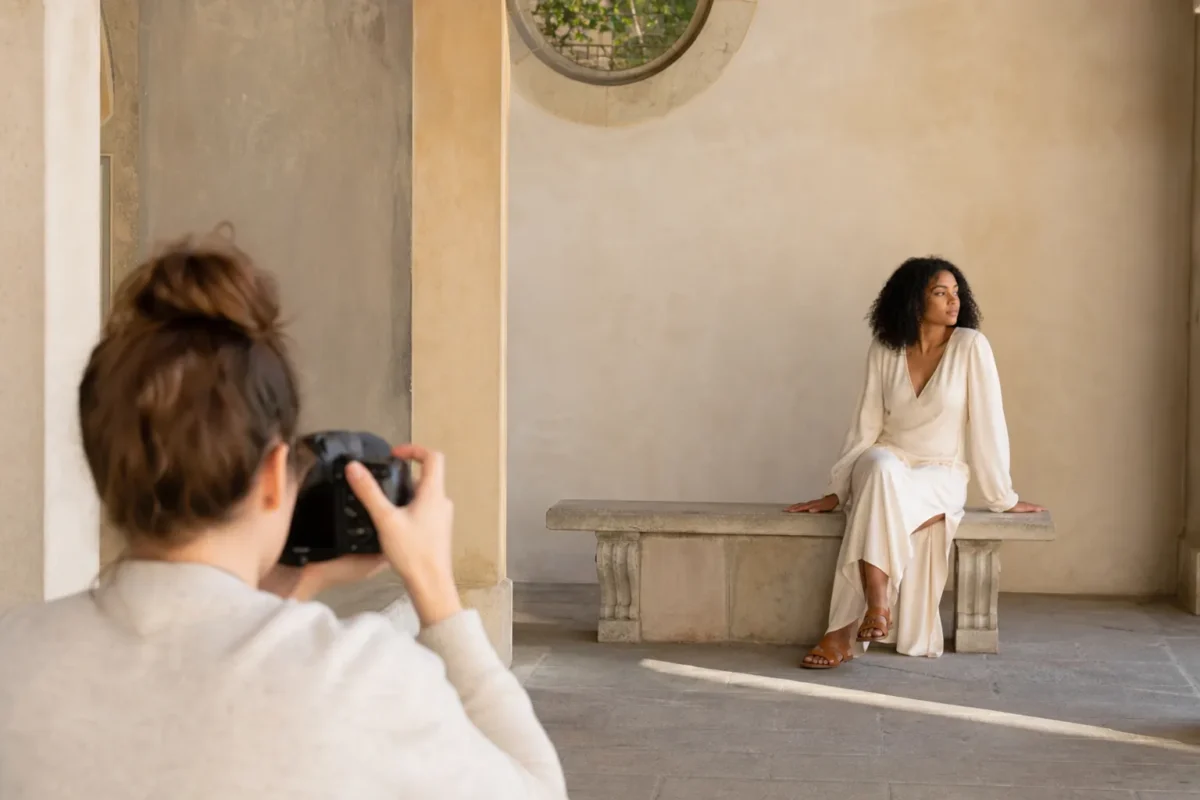
Start With the Main Subject
Before you balance a frame, decide what the photo is about.
This sounds obvious, but many unbalanced images start with an unclear subject. The photographer sees good light, a beautiful location, or an interesting background and starts composing before choosing the anchor.
Ask one question first:
Where should the viewer look first?
That answer controls the rest of the frame.
If the subject is a portrait, the face and expression usually carry the most weight. If it is a landscape, the subject might be a mountain peak, a road, a lone tree, or the relationship between foreground and sky. If it is a wedding or event photo, the subject may be a gesture: a hand, a glance, a reaction, a hug.
Once the subject is clear, everything else has a job. It can support the subject, balance the subject, add context, or leave the frame.
Understand Visual Weight
Visual weight is the reason balance works.
Some parts of a photo feel heavier than others. They pull the eye faster and hold attention longer.
These elements usually carry strong visual weight:
- faces and eyes
- bright highlights
- bold colors
- large objects
- sharp details
- strong contrast
- dark shapes against light backgrounds
- warm colors like red, orange, and yellow
- subjects near the edge of the frame
- text, signs, or recognizable symbols
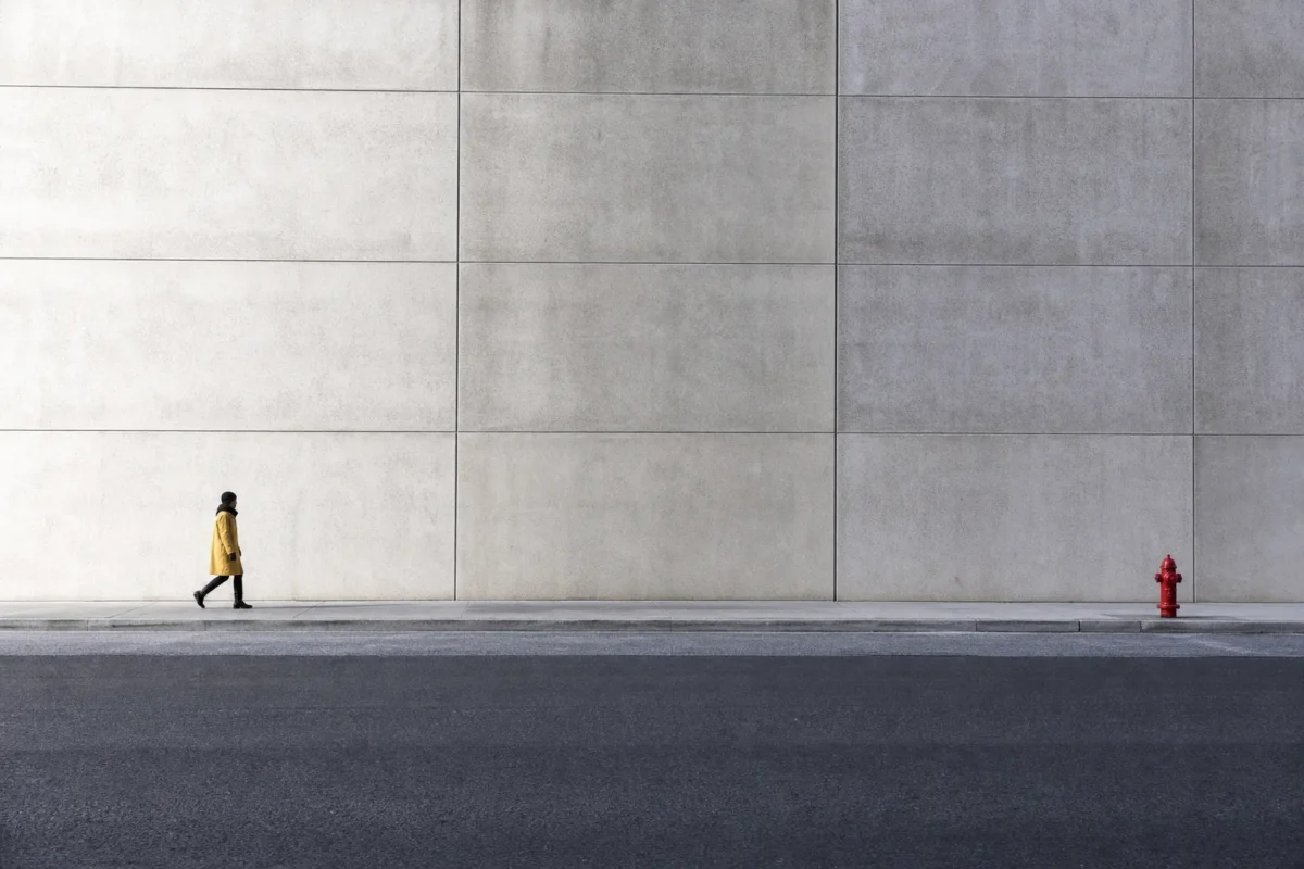
This is why a tiny red bag in the corner can overpower a portrait. It is also why a small person in a wide landscape can still feel strong if the surrounding space is simple.
Balance happens when you notice what carries weight and decide how those weights should relate.
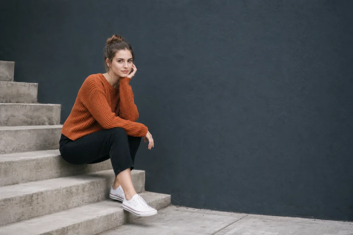
A large dark wall can be balanced by a small bright subject. A person on the left can be balanced by open space on the right. A colorful dress can be balanced by a muted background. A heavy foreground can be balanced by a strong light source in the distance.
Do not only ask, “Is the subject centered?”
Ask, “Where does my eye go, and does that path support the photo?”
Symmetrical Balance
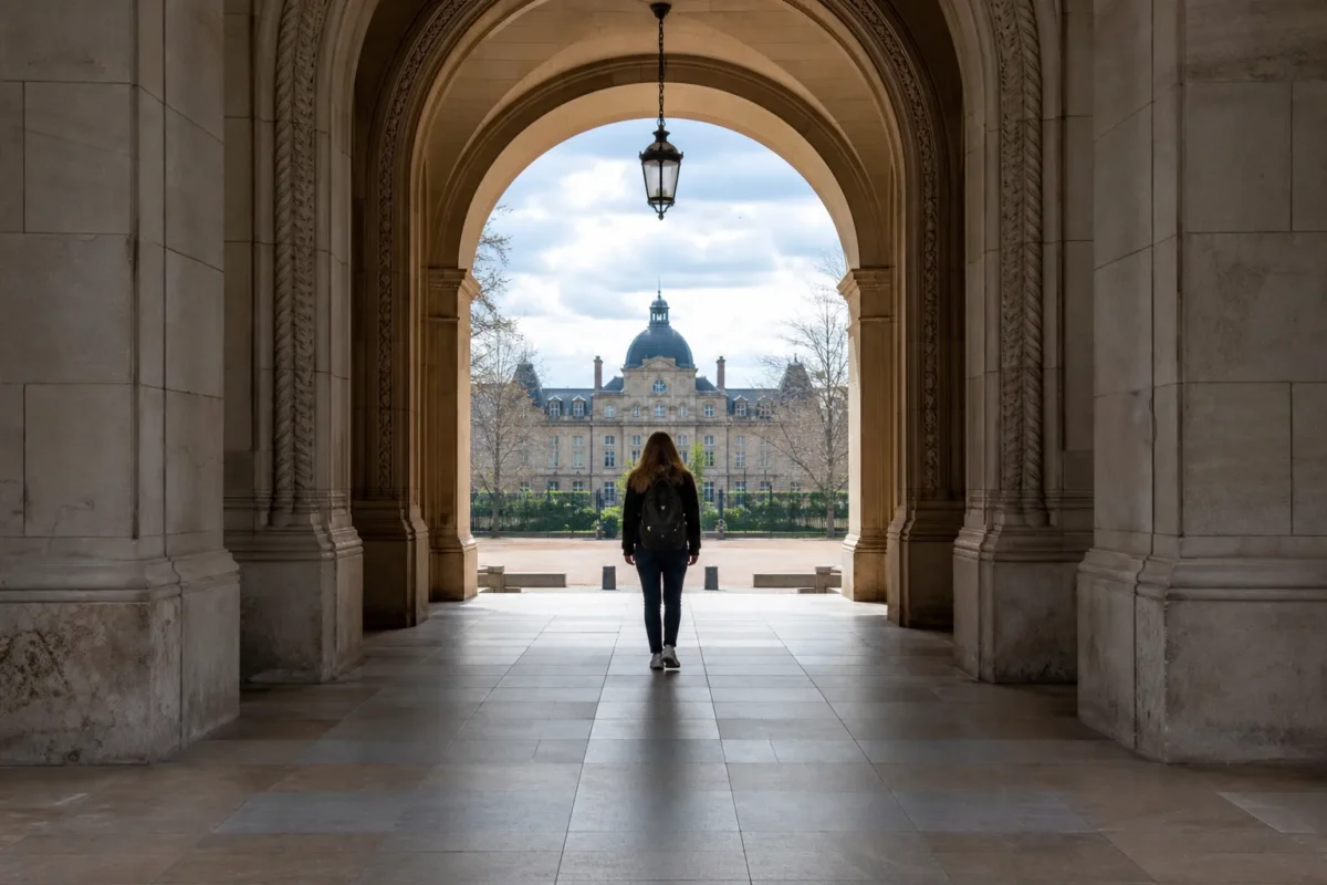
Symmetrical balance happens when both sides of the frame feel similar, mirrored, or evenly weighted.
It often creates a calm and organized feeling. It works well for reflections, architecture, centered portraits, still water, hallways, bridges, staircases, and quiet landscapes.
Symmetry is powerful because it is easy to read. The viewer understands the structure quickly. The frame feels stable.
Use symmetrical balance when you want:
- calm
- order
- formality
- stillness
- visual strength
- a centered subject
But symmetry has a risk. If the photo is almost symmetrical but slightly off, it may look accidental. A crooked doorway, uneven reflection, or subject that is not quite centered can feel sloppy instead of intentional.
When you use symmetry, commit to it. Align carefully. Check the verticals. Watch the edges. Make sure the subject is strong enough to hold the center.
Asymmetrical Balance
Asymmetrical balance happens when different elements balance each other without matching.
This often feels more natural than symmetry. It is common in portraits, documentary work, street photography, travel, weddings, products, landscapes, and editorial images.
Examples:
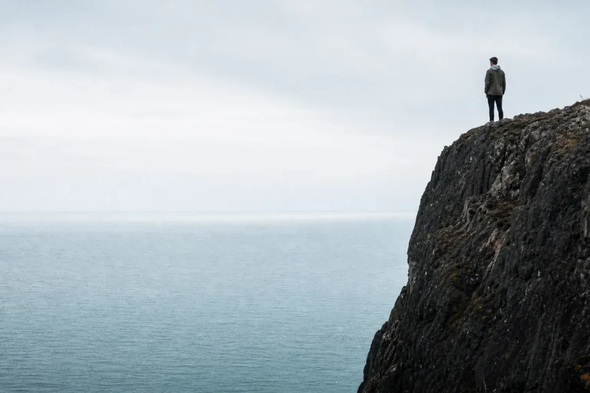
- a small person balanced by a wide area of sky
- a bright face balanced by a darker wall
- a subject on one third balanced by open space on the other side
- a warm color balanced by a cool background
- a strong foreground shape balanced by a distant subject
- a large quiet area balanced by one sharp detail
Asymmetry gives the photo movement. It lets the viewer travel through the frame.
The challenge is that it requires more judgment. The elements do not match, so you have to feel whether the weight is working.
If the frame feels off, move before you shoot. Step left or right. Lower the camera. Back up. Change the distance between the subject and the edge. Give the subject more breathing room. Remove a distracting bright spot if you can.
Asymmetrical balance is not random imbalance. It is uneven weight arranged with purpose.
Use Negative Space as a Counterweight
Negative space is one of the cleanest ways to create balance.
Negative space is the open or quiet area around the subject: sky, wall, water, fog, sand, snow, grass, shadow, or a simple background.
Empty space is not wasted space. It carries visual weight in a quieter way.
A small subject can feel strong when the negative space gives it room. A portrait can feel more elegant when the subject is not crowded by background detail. A product can look more premium when the surrounding space is clean.
Negative space works especially well when it supports direction.
If a person is looking to the right, space on the right gives the gaze somewhere to go. If a runner is moving forward, space in front of the body makes the image feel more natural. If the subject is pressed against the edge they are looking toward, the frame can feel cramped.
Use negative space when:
- the subject is visually strong but small
- the background can stay simple
- the image needs calm
- the subject needs breathing room
- the story is about isolation, scale, quiet, or focus
Do not fill space just because it is empty. Empty space can be the thing that balances the photo.

Balance With Light and Shadow
Light has visual weight.
The eye usually goes to the brightest readable area first. That means a bright patch in the background can pull attention away from the subject, even if the subject is technically sharp.
Use light to support the subject.
In a portrait, the face can be the brightest clean area. In a product image, the product can hold the strongest highlight. In a wedding reception, a lit expression can balance a darker room. In street photography, a person crossing through a pool of light can balance a large shadow.
Shadow can also balance a frame. A dark shape can anchor one side. A shadowed edge can keep the viewer inside the composition. A darker background can make a small bright subject feel stronger.
When composing, check:
- Is the brightest area the subject or a distraction?
- Does the shadow create structure or clutter?
- Does contrast guide the eye or split the frame?
- Would moving slightly change how the light balances the subject?
Light balance is not only an editing problem. It starts with where you stand.
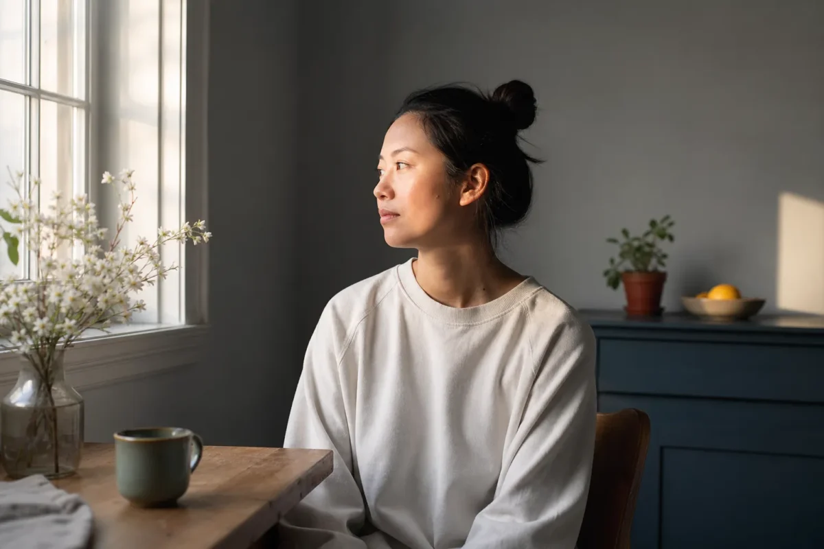
Balance With Color
Color can carry more visual weight than size.
A small red object can overpower a large neutral wall. A warm orange light can pull attention faster than a cool blue shadow. A saturated dress can become the center of the image even when the face should matter more.
Use color to create connection.
You can balance color by repeating it in small ways across the frame. A warm subject can be supported by a warmer background detail. A cool scene can hold one warm highlight. A bold color can sit against a calmer neutral area.
Color balance does not mean every color needs to match. It means color should not fight the subject.
In post, this becomes especially important. If you push greens too far, the grass may steal attention from the person. If skin becomes too orange, the image may feel artificial. If shadows turn too blue, the photo can feel stylized in a way that does not match the story.
Good color balance keeps the viewer on the subject while making the whole image feel cohesive.
Balance With Layers and Depth
Balance is not only left versus right. It also happens from front to back.
Foreground, middle ground, and background all carry weight.
A strong foreground can make a scene feel grounded. A clear middle-ground subject can anchor the frame. A simple background can let the subject breathe. When all three layers compete, the photo feels crowded.
Layered balance is useful in:
- wedding and event coverage
- street photography
- travel photography
- environmental portraits
- landscapes
- product lifestyle scenes
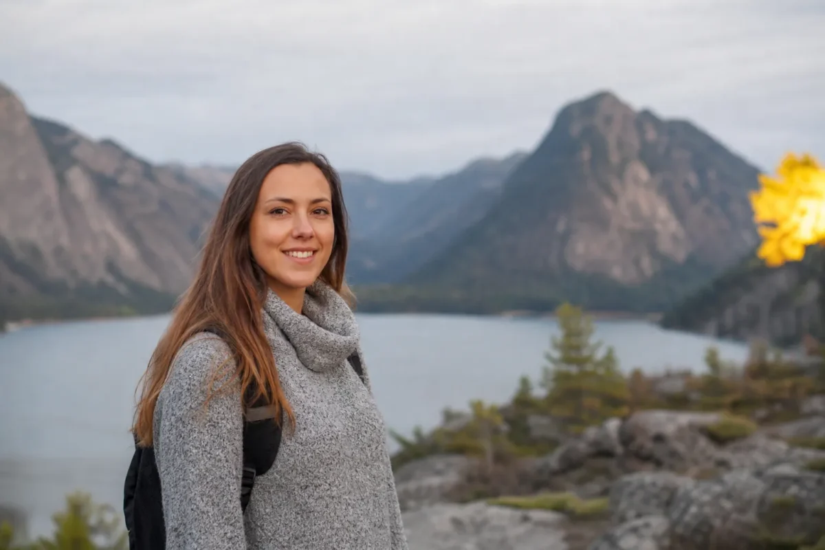
For example, a doorway in the foreground can frame a subject in the middle ground while a quiet background adds context. A landscape can use rocks in front, a path in the middle, and mountains in the distance. A reception photo can use guests in the foreground, the couple in the light, and darker room detail behind them.
The key is hierarchy. Layers should guide attention, not create clutter.

When Intentional Imbalance Works
Not every photo needs to feel perfectly balanced.
Intentional imbalance can create tension, movement, loneliness, speed, pressure, or unease. A subject placed close to the edge can feel dynamic. A large dark area can feel dramatic. A tilted visual weight can make the photo feel unstable on purpose.
The difference is intent.
Accidental imbalance feels like the photographer did not notice the frame. Intentional imbalance feels like the photographer made a choice.
Use imbalance when it supports the mood:
- a runner leaving the frame
- a portrait pushed into shadow
- a subject surrounded by too much space to show isolation
- a documentary moment that feels chaotic on purpose
- a product image that uses tension to feel modern
Even then, check the frame. The viewer should feel tension, not confusion.
Common Balance Mistakes
The first mistake is letting distractions carry too much weight.
Bright signs, cluttered corners, random faces, high-contrast objects, and bold colors can pull the eye away from the subject. Always scan the edges before you shoot.
The second mistake is centering everything without a reason.
Centered compositions can be strong, but centering by default often makes photos feel static. If you use symmetry, make it precise. If the scene needs movement, try an off-center subject and balance it with space, light, or another element.
The third mistake is leaving too little breathing room.
When the subject is too close to the edge, the image can feel cramped. Give the subject space to look, move, or exist unless the tightness is intentional.
The fourth mistake is overfilling the frame.
More detail does not always make a photo stronger. A simpler frame often balances better because the subject has fewer competitors.
The fifth mistake is relying on crop alone.
Cropping can refine balance, but it cannot always fix poor placement, awkward light, or a busy background. Move in camera first.
How to Refine Balance in Post
Balance starts in camera, but post-production can protect it.
The pressure appears after the shoot. You may have several strong images, but each one has small problems. One frame has a bright edge. Another has a distracting background object. Another has better subject placement but weaker color. If you are delivering a full gallery, the set also needs to feel consistent.

Start with culling.
Choose the images where the subject is clear and the frame already feels intentional. Do not keep a photo just because the location is beautiful. If the visual weight fights the subject, the image will take more work and may still feel off.
Then refine the crop.
Straighten verticals. Remove thin bright distractions near the border. Give the subject enough space. Do not crop so tightly that the composition loses its breathing room.
Next, adjust light and color.
Use brightness to keep the viewer on the subject. Reduce background distractions. Keep skin tones natural. Control saturated colors so they support the frame instead of stealing attention.
For cleanup, Evoto Object Removal can help simplify distracting edges or backgrounds when one small element carries too much visual weight. The point is not to rebuild the scene. It is to keep attention where the composition already wants it to go.
For color direction, Evoto AI Color Match can help create a consistent starting point across images with different lighting or color weight. This is useful when one image has warm window light, another has cooler shade, and the final gallery still needs to feel cohesive.
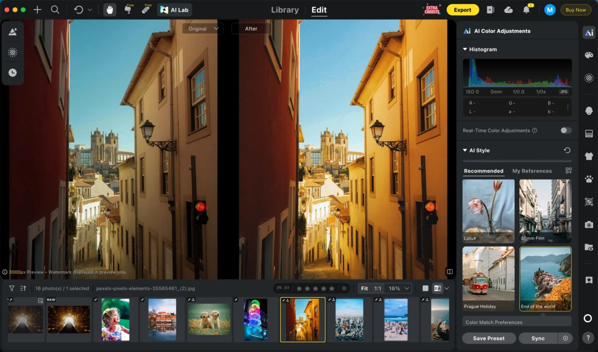
For larger deliveries, Evoto Batch Edits can support consistency across similar frames. Balance is not only inside one image. A gallery also needs rhythm: strong images, quiet images, close images, wide images, and color that does not jump from frame to frame.
If you need more targeted control, Evoto’s guide to local adjustment is useful because many balance problems are local: a bright corner, a dark face, a color patch, or a background area that needs to sit back.
Good editing should make the original composition easier to read. It should not make the photo look like a different scene.


Powerful AI Photo Editor
Balance Checklist for the Field
Before you press the shutter, ask:
- What is the main subject?
- Where does my eye go first?
- Is that where I want the viewer to look?
- Does one side feel too heavy?
- Is that weight intentional?
- Can negative space balance the subject?
- Is a bright area or bold color stealing attention?
- Do foreground, middle ground, and background support each other?
- Would moving left, right, lower, closer, or farther back improve the balance?
- Does the photo need calm, movement, tension, or stability?
After the shoot, ask:
- Is this frame balanced in camera, or am I hoping to fix it later?
- Does the crop support the subject?
- Does the color treatment keep attention in the right place?
- Are background distractions carrying too much visual weight?
- Does this image fit the rhythm of the full delivery?
Final Thoughts
Balance in photography composition is not a rule that tells you where everything must go.
It is a way to read visual weight.
Once you understand what pulls attention, you can arrange the frame with more control. You can use symmetry for calm. Asymmetry for movement. Negative space for breathing room. Light for direction. Color for connection. Layers for depth.
The strongest balanced photos do not feel forced. They feel intentional.
Start with the subject. Notice what carries weight. Move before you crop. Then use editing to refine the balance that was already there.
Try Evoto AI Photo Editor
Retouch photos with Evoto AI and make your photos best! Available on Windows, MacOS and iPadOS.