

A color splash edit should make one part of the frame feel intentional. Instead, it often makes the whole photo feel dated.
The skin goes grey. The hair gets a glowing outline. The red dress pops, but so does the stop sign, the lipstick, and half the jacket. What was supposed to look editorial starts to read like a phone filter from 2010.
Most cheap color splash results are not caused by the idea itself. They come from the same seven editing mistakes repeated in a hurry. Fix those, and the effect can still look current.
What Makes a Color Splash Edit Look Cheap
A strong color splash edit has three qualities:
- one clear visual decision
- clean separation between colored and monochrome areas
- a monochrome base that still has contrast and depth
A cheap one usually fails on separation. The viewer notices the technique before the subject, the story, or the wardrobe choice.
That is why these mistakes matter for working photographers. Clients may ask for a color splash variation, but they will not thank you for skin that looks drained, halos around the hair, or a gallery where every image uses the same gimmick.
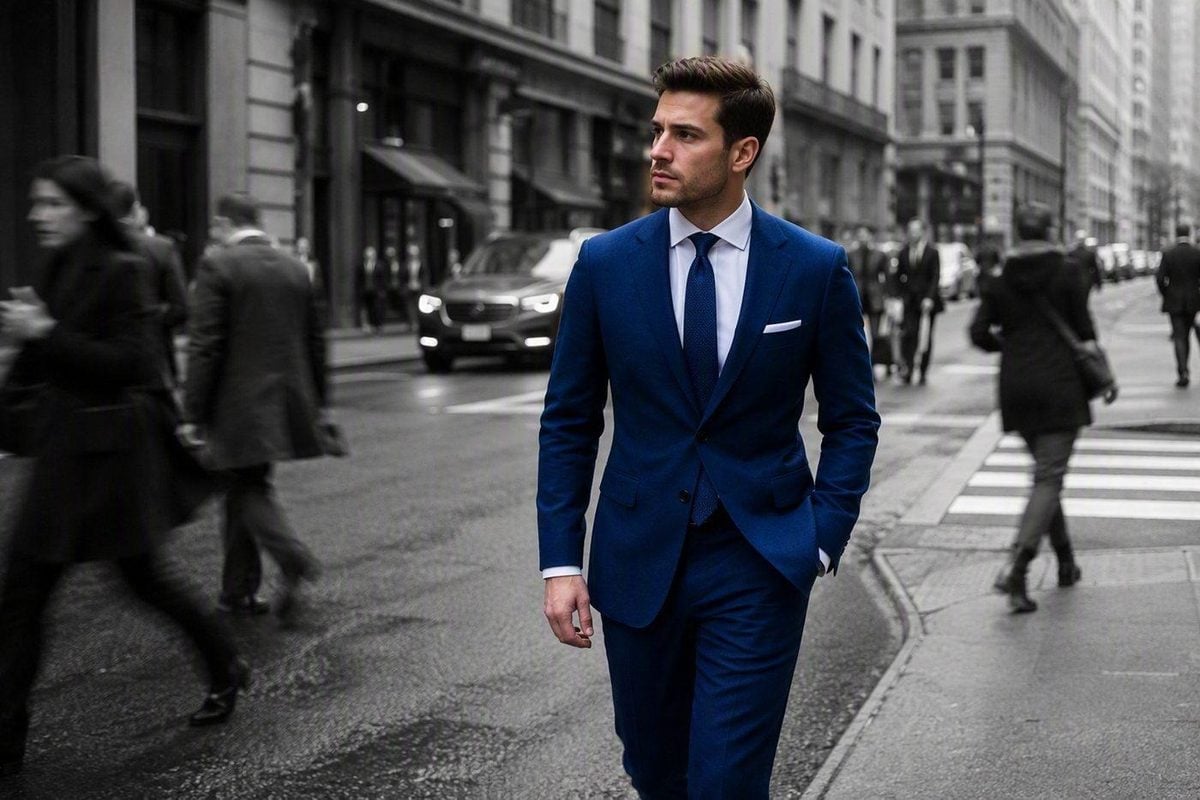
Mistake 1: The Subject’s Skin Turns Grey
This is the fastest way to ruin a color splash portrait.
It happens when global desaturation hits the face, when the subject mask is incomplete, or when the edit keeps only one clothing color active but pulls saturation away from skin at the same time.
The result looks lifeless. Cheeks lose warmth. Lips look dusty. The person no longer feels like the anchor of the image.
How to fix it
- Finish exposure and white balance on the color file before the effect
- Mask the full subject, not just the accent item, when the person should stay in color
- Check forehead, ears, neck, and hands at 100% zoom
- If only one object stays colored, verify that skin is not being partially desaturated by a hue-based selection
Mistake 2: Visible Halos Around Hair and Shoulders
Halos make a selective color edit look cut out instead of photographed.
They usually come from:
- an auto mask with too much feather
- painting too broadly around the subject
- desaturating the background before refining edge contrast
- hair, veils, or fuzzy jackets sitting against a busy backdrop
Once the halo is there, increasing saturation on the accent only makes it worse.
How to fix it
- Refine the mask on hair, shoulders, glasses, and jacket edges
- Use edge-aware selection tools instead of one broad brush pass
- Reduce mask feather slightly and clean transitions by hand
- Compare the edit at both full size and social delivery size
Halos are a masking problem, not a color problem. Fix the edge before you push the effect harder.
Mistake 3: Too Many Accidental Colors Stay Active
A color splash edit fails when the frame still has five things fighting for attention.
Common leaks include:
- background signs
- lipstick or blush that matches the accent hue
- flowers, balloons, or props in the same color family
- streetlights, cars, or clothing in the distance
- reflections picking up the accent color
This often happens when editors use a hue-based selective color tool without checking the whole frame.
How to fix it
- Decide whether the edit is subject-based or hue-based before you start
- Scan the full image at thumbnail size after the first pass
- Paint unwanted color back to monochrome on the mask
- Remove or simplify distracting objects before stylizing if they compete with the accent
Mistake 4: Over-Saturating the Accent After the Background Goes Monochrome
Once the rest of the image goes black and white, it is tempting to push the remaining color harder.
That is how you get neon dresses, radioactive flowers, and lipstick that no longer matches the light in the scene.
The accent should still obey the original exposure. If the red coat was muted in shade, it should not become a saturated poster red just because the background is grey.
How to fix it
- Restore color first, then adjust saturation gently
- Match the accent to the original lighting, not to maximum slider impact
- Compare the colored area against the untouched color original
- If the accent needs that much saturation to survive, the source image may be wrong
A believable color splash should feel chosen, not amplified.
Mistake 5: The Monochrome Base Looks Flat and Muddy
Cheap color splash edits often focus on the accent and ignore the black-and-white foundation.
When the monochrome side loses contrast, the whole image feels dull. Grey backgrounds turn patchy. Skin-adjacent areas look dirty. The accent floats on top of a lifeless base instead of sitting inside a strong photograph.
How to fix it
- Build a real black-and-white conversion with contrast and tonal separation
- Clean uneven backdrops before desaturating them
- Check seamless paper, sky, and wall areas for banding or blotchy falloff
- Add local contrast to the monochrome areas if needed before calling the edit finished
The background has to look intentional on its own. If the black-and-white version is weak, color splash will not save it.

Mistake 6: The Accent Is Too Small or Too Weak to Read
Some color splash edits fail before masking ever becomes the problem.
The accent may be:
- a tiny detail in the background
- a bracelet lost at Instagram size
- a flower smaller than the subject’s face
- a color too close to the backdrop or skin tone
At full resolution the edit may look technically correct. At delivery size it disappears—or worse, looks like a processing error.
How to fix it
- Choose accents with clear size and contrast
- Test the image at the size clients will actually view
- Favor wardrobe, a bouquet, an umbrella, or a full subject over tiny props
- Skip the effect if the accent cannot carry the frame
Color splash works best when the viewer understands the choice in one second.
Mistake 7: Using Color Splash on Every Image—or as a Rescue Edit
This is the delivery mistake.
Photographers apply color splash to:
- every portrait in the gallery
- a boring photo that lacked composition
- a set where only one frame actually supports the effect
- client work that was supposed to stay natural
Then the portfolio starts to look themed by accident. The effect stops feeling special because it is everywhere.
How to fix it
- Use color splash as a select variation, not the default export look
- Keep the main gallery natural and offer one or two stylized versions where the image supports it
- Do not use the effect to fix weak light, weak separation, or weak subject choice
- Ask whether the photo is stronger with the effect—or just louder
The best color splash edits feel like a deliberate alternate, not a crutch.
How to Fix Cheap Color Splash Edits in Your Workflow
Most of these mistakes come from the same workflow error: stylizing before the base image and the mask are stable.
A cleaner sequence looks like this:
- Correct the color original
- Decide subject pop, hue pop, or studio backdrop simplification
- Build and refine the mask
- Create a strong monochrome base
- Restore or protect color only where it belongs
- Check skin, edges, and accidental color leaks
- Export only the images that are genuinely stronger with the effect
In Lightroom and Photoshop, that means protecting the subject first and cleaning the mask before adjusting saturation. For portrait sets, Evoto can speed up the same process by applying consistent adjustments across multiple images much faster. For more creative selective-color techniques, see our guide on how to create a color splash effect in Photoshop.
If you want to achieve the effect quickly, you can use Evoto’s online Color Splash tool to create the effect directly in your browser, without having to build the selection and masking process from scratch.
Start with global desaturation or a black-and-white look only after the base portrait is stable. Then use AI Masking Editor to isolate the subject, clothing, or backdrop without rebuilding a manual cutout on every file. For studio work with uneven seamless paper, Clean Background helps the monochrome side stay smooth before you simplify it.
Once the color splash structure is clean, finish the face in Portrait Retouching only if the image still needs a normal delivery pass. Do not use skin retouching to compensate for a bad mask.
For more on selective desaturation and masking fundamentals, see How to Desaturate Color in Photos and What Is Image Masking and How to Use It.
Final Thoughts
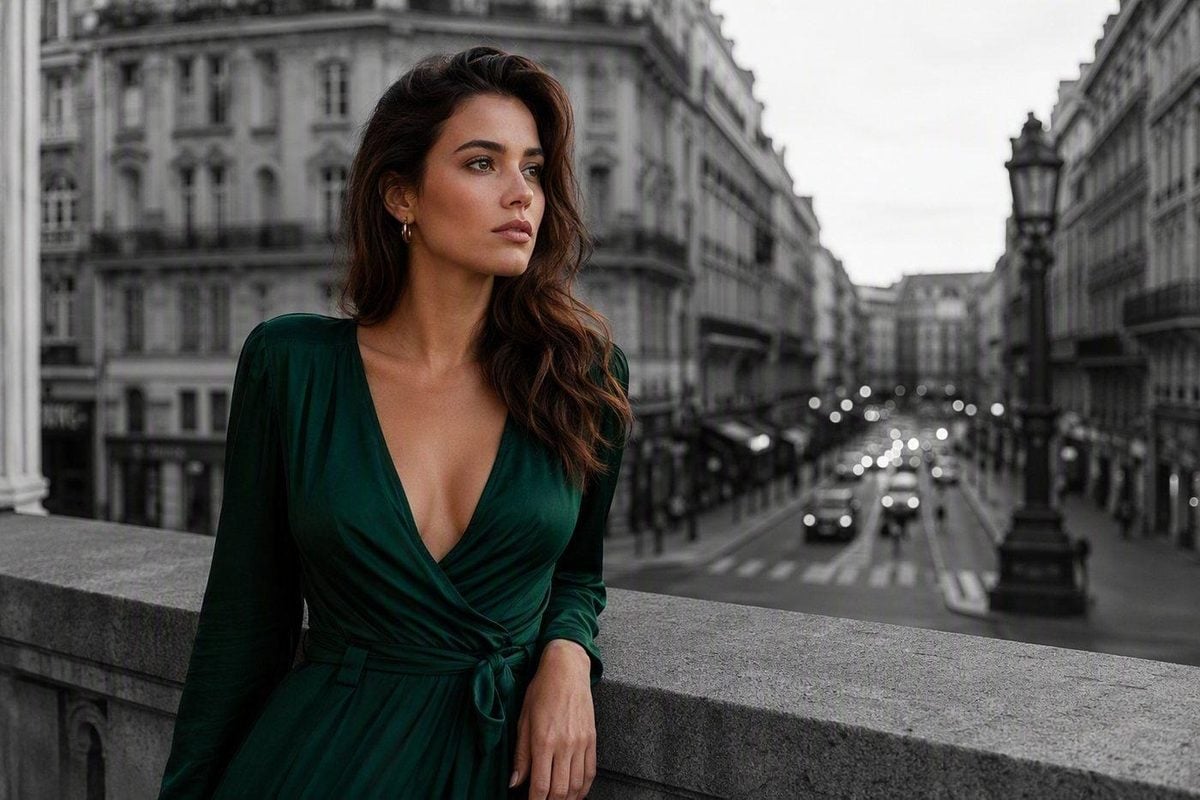
Color splash does not look cheap because the effect is outdated. It looks cheap when the mask is sloppy, the skin is neglected, the accent is pushed too hard, and the edit is used everywhere.
Avoid those seven mistakes and the effect can still feel graphic, editorial, and intentional. Protect the subject. Simplify with purpose. Keep the accent believable. Use it selectively.
That is what separates a finished portrait variation from a filter demo.
Try Evoto AI Photo Editor
Retouch photos with Evoto AI and make your photos best! Available on Windows, MacOS and iPadOS.