

Photographers use “selective color” and “color splash” as if they mean the same thing. Sometimes they do. Sometimes they do not.
In everyday editing talk, both phrases point to a monochrome image with color left in. In practice, the method and the intent are different. One usually keeps a color family. The other usually keeps a subject. And in Photoshop, Selective Color is also the name of a completely different adjustment tool used for grading, which makes the search results even messier.
If you pick the wrong approach, you get leaks: red lips returning with a red dress, green signs returning with green leaves, or a splash that looks random instead of directed. This guide separates the two effects, shows when each one works, and covers a faster finishing path when the look needs to ship more than once.
What Photographers Usually Mean by Each Term
Color splash
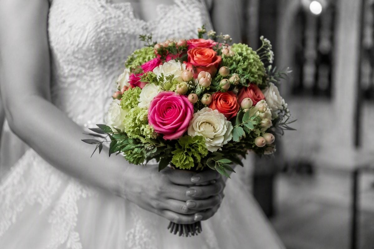
A color splash effect turns most of the photo black and white, then restores color on a chosen subject or area: a jacket, umbrella, product, flower, or prop.
The decision is spatial. You ask, “What object deserves color?” The rest of the frame supports that choice in grayscale.
Selective color
Selective color, in the popular photography sense, keeps one or more hue ranges and removes saturation from the rest. You might keep reds across the whole frame, or yellows only, while blues and greens fall to gray.
The decision is chromatic. You ask, “Which color family should survive?” Every object that contains that hue can stay partially or fully colored unless you clean it by hand.
The Photoshop naming trap
Photoshop also has Image > Adjustments > Selective Color / Selective Color adjustment layers. That tool changes Cyan, Magenta, Yellow, and Black amounts inside color ranges. It is a grading and correction tool, not an automatic color-splash generator.
So when someone searches “selective color Photoshop,” they may mean:
- The B&W + color-keep effect
- Hue-based saturation control
- The actual Selective Color adjustment for color grading
This article uses “selective color” for the popular mono-plus-hue effect, and calls out the Photoshop adjustment by name when needed.
Color splash example with one subject kept in color against a monochrome scene
Selective Color vs Color Splash: The Real Differences
| Point | Color splash | Selective color |
| Core question | Which subject stays in color? | Which hue stays in color? |
| Typical method | B&W layer + paint/mask on one object | HSL/Color Mixer or Color Range by hue |
| Best look | One clear accent, directed attention | Repeating color motif across the frame |
| Common failure | Rough subject edges | Unwanted objects sharing the same hue |
| Feels like | Spotlight on a person or product | Graphic color filter with mono support |
They overlap. A red dress splash can look a lot like “keep reds.” The difference shows up in cleanup:
- Splash thinking protects the dress and removes red from lips, taillights, and signs if those fight the subject.
- Hue thinking keeps red wherever it appears unless you paint it out afterward.
If your goal is storytelling around one person or product, splash logic is safer. If your goal is a graphic pattern of one color through the scene, selective-color logic is safer.
When to Use Color Splash
Use color splash when the photo already has a hero.
Strong use cases:
- Portrait with one clothing accent
- Product on a busy set where brand color must read first
- Wedding detail where only the bouquet or shoes should pop
- Street frame where one umbrella or sign is the point
Color splash works best when:
- The accent has clean edges or edges you are willing to mask
- The rest of the frame still looks strong in black and white
- You can live with one main color decision
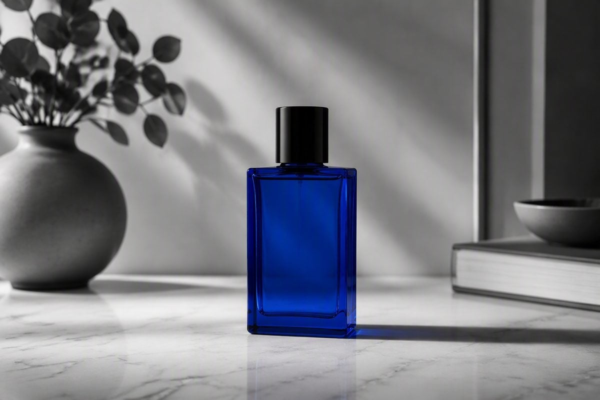
Skip it when the subject is weak, the frame is already simple, or color relationships are the whole story. Turning a balanced full-color portrait into splash just because the effect is trendy usually makes the edit feel older, not stronger.
For a full Photoshop walkthrough of the splash method, see How to Create a Color Splash Effect in Photoshop.
When to Use Selective Color
Use selective color when the color itself is the subject.
Strong use cases:
- A field of red flowers against mixed foliage
- Yellow taxis or repeated brand elements in a street set
- Sports or event frames where one jersey color should dominate
- Graphic social crops built around a single hue motif
Selective color works best when:
- The kept hue is concentrated where you want attention
- Competing objects do not share that hue too heavily
- You are ready to clean false positives after the first pass
Skip it when skin, lips, food, or product packaging all contain the same target hue and you cannot afford the cleanup. In those files, splash masking around one object is usually faster than fighting every pixel of that color.
If you need a cleaner mono base first, see How to Make a Photo Black and White. If the job later turns into changing an object’s color rather than isolating it, see How to Change Color of an Object in a Photo.
How to Decide in 30 Seconds
Ask these questions in order:
- Is there one subject that must win?
Yes → color splash. - Is the story a repeating color across many objects?
Yes → selective color. - Does the target hue also live in skin, signs, or junk?
Yes → prefer splash, or plan extra cleanup after hue isolation. - Do you need Photoshop’s Selective Color adjustment for grading?
That is a different tool. Use it for color correction and look development, not as your first click for a splash effect.
A practical rule: compose and shoot for the effect you want. Splash needs a readable accent subject. Selective color needs a dominant hue that does not contaminate faces and backgrounds.
Common Mistakes With Both Effects
- Keeping too many accents until the frame feels speckled
- Pushing the remaining color into neon saturation
- Ignoring 100% edge checks around hair and fabric
- Using hue isolation on portraits without protecting skin
- Applying either effect to a weak composition and expecting style to save it
- Confusing Photoshop’s Selective Color grading tool with a one-click splash preset
Both effects fail the same way when the edit is louder than the photograph. The mono side still needs contrast, shape, and a reason to exist.
How Evoto Fits After You Choose the Effect
The Photoshop method is right when one hero image needs a perfect edge. It gets expensive when the job is “make this accent read clearly, keep it natural, and move on.”
That is the pressure point where Evoto fits. Once you already know what should stay in color, you do not need a full Black & White adjustment stack. Isolate the accent, invert to target everything else, and remove saturation from the surrounding frame.


Powerful AI Photo Editor
1. Upload the photo to Evoto
Open Evoto and upload the image. Confirm the splash target before you edit: one jacket, product, umbrella, or prop. If the photo has no clear accent, no tool will invent one.
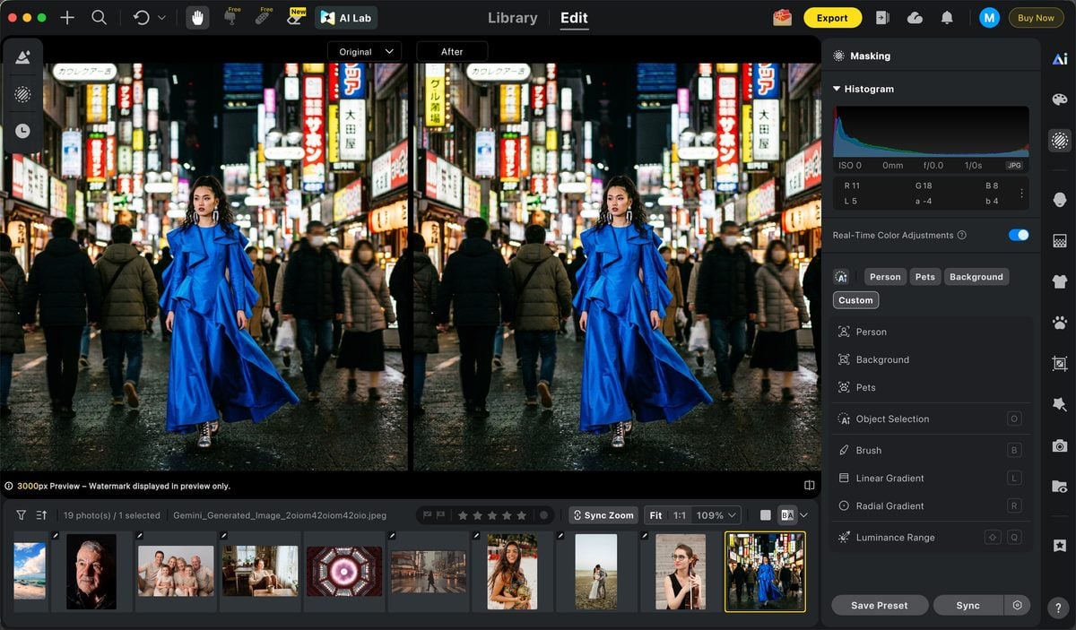
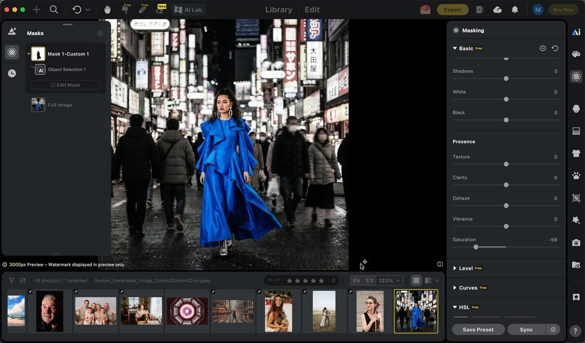
2. Open Mask, select the object, then invert
Open the mask tools and select the object that should remain in color. Then invert the selection so the edit targets the rest of the image—the areas that should go black and white.
This is the key shortcut. Instead of painting color back onto the subject after a global mono conversion, you protect the accent first and work on everything around it.
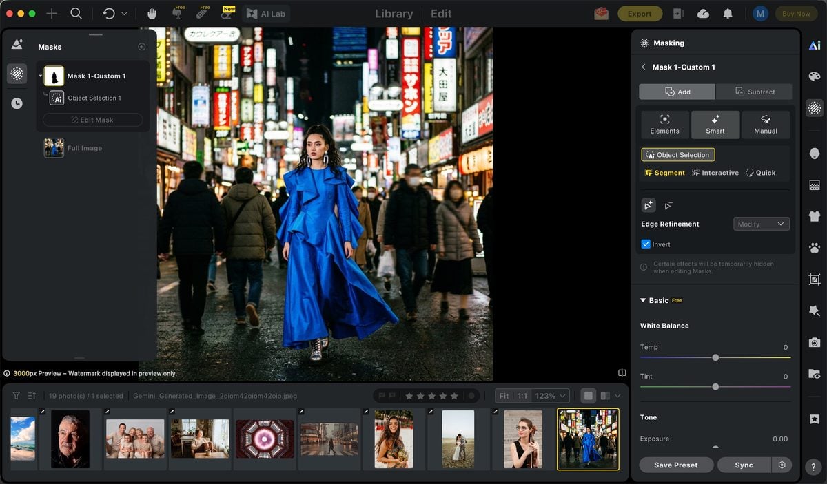
3. Adjust saturation
With the inverted selection active, lower saturation until the surrounding frame turns cleanly monochrome. Keep the accent object untouched so its original color stays. If a little color still leaks near edges, refine the mask and check the result at 100%.
Do not push the remaining accent into neon. The splash should still look photographed, not pasted.
If you later need a stronger local color push on the kept object itself, Evoto’s color tools can refine that accent after the mono split is set. See AI Change Image Color when the job moves from isolation into controlled recolor.
4. Export
Zoom in, confirm the edges around the accent still look clean, then export. For similar crops or product variants, repeat the same mask-and-invert logic instead of rebuilding a Photoshop layer stack each time. When several frames share the same treatment, Batch Edits help keep the finishing pass consistent once the first splash is right.
The point is not to replace Photoshop’s precision on a single composite. The point is to shorten the path when the color splash is a delivery effect, not a retouching marathon.
If you want to achieve the effect quickly, you can use Evoto’s online Color Splash tool to create the effect directly in your browser, without having to build the selection and masking process from scratch.
Final Thoughts
Selective color vs color splash is less about fashion and more about control.
Use color splash when a subject should stay vivid inside a black-and-white world. Use selective color when a hue family is the point of the image. Keep Photoshop’s Selective Color adjustment in the grading toolbox, not as a substitute for either effect.
Choose the logic first. Then finish faster when you can: upload to Evoto, select the accent and invert, lower saturation on the rest, and export. Photoshop wins on hard one-off masks. Evoto wins when the decision is already clear and you need the look out the door.
Try Evoto AI Photo Editor
Retouch photos with Evoto AI and make your photos best! Available on Windows, MacOS and iPadOS.