

A frame can fail because it has too little. More often, it fails because it has too much.
The subject is there. The light is usable. The exposure is fine. But the viewer’s eye keeps jumping to a bright sign, a half-cut branch, a busy background, a loud color patch, or an object near the edge that has no job.
That is where simplicity in photography composition matters. Simplicity does not mean empty photos. It means clear photos. It is the habit of deciding what the image is about, then removing, hiding, softening, cropping, or controlling everything that weakens that idea.
For working photographers, this is not only a minimalist style. It is a practical delivery skill. Clean composition helps portraits feel more professional, product photos feel more premium, travel images feel more intentional, and galleries feel easier to edit consistently.
What Simplicity Means in Photography
Simplicity in photography is visual clarity.
It asks a direct question: What should the viewer notice first?
Once you know the answer, every part of the frame has to earn its place. The subject, light, background, foreground, color, shadow, gesture, and empty space should all support the same idea.
That does not mean every simple photo has only one object. A clean portrait can include a face, hands, clothing, wall texture, and shadow. A simple landscape can include sky, water, sand, rocks, and a person. A simple event image can include several people if the gesture, light, and hierarchy are clear.
The issue is not the number of elements.
The issue is whether the elements compete.

A simple composition gives the viewer a clean path through the image. A cluttered composition makes the viewer work too hard before they find the point.
That is why simplicity is closely connected to negative space, visual weight, balance, and subject placement. These tools all help decide what leads and what stays quiet.
Start With the Subject, Not the Scene
Many cluttered photos start with a scene that looks interesting. A street corner has color. A forest has texture. A wedding reception has movement. A market has faces, signs, food, light, and activity. A studio setup has props, wardrobe, cables, shadows, and background detail.
The camera can see all of it. The final photo should not necessarily show all of it.
Before you raise the camera, name the subject as specifically as possible:
- the bride’s hand reaching for the bouquet;
- the athlete separated against the clean part of the field;
- the coffee cup shape and steam, not the whole table;
- the model’s profile against the wall shadow;
- the lone tree under a large sky;
- the product edge and texture, not the whole shelf.
Once the subject is clear, composition becomes easier. You can decide what to include, what to crop out, what to blur, what to darken, and what to wait for.
Simplicity begins before the shutter.
It begins with commitment.
Use Exclusion as a Composition Tool
Exclusion is one of the most useful habits in composition. It means leaving out anything that does not help the photograph.
This can happen in several ways. You can move closer. You can step left or right. You can raise the camera. You can lower it. You can wait for a person to leave the background. You can change focal length. You can use a wider aperture. You can crop tighter. You can choose a cleaner wall, sky, shadow, field, doorway, or surface.
The goal is not to make the scene less true.
The goal is to make the photograph more readable.

This is especially important in busy environments. In street photography, a half-second can move a distracting pedestrian out of the frame. In weddings, one step can hide a wall outlet behind a dress. In portraits, a slight camera height change can keep a background line from cutting through the head. In product work, rotating the item can remove a bright reflection from the edge.
Small exclusions often make the image feel more expensive. They also save editing time.
If you can remove a distraction with your feet, do it before you rely on software.
Use Negative Space Without Making the Photo Empty
Negative space is the clean or quiet area around the subject. It might be sky, wall, water, sand, shadow, pavement, fog, fabric, studio backdrop, or an out-of-focus background. It gives the subject room to breathe and makes the viewer’s eye settle faster.
Negative space is one of the cleanest ways to use simplicity in photography composition. But empty space is not automatically strong.
The space still needs a job.
It can create calm. It can show scale. It can make a subject feel isolated. It can leave room for layout, advertising copy, magazine cover text, or social crop. It can make a portrait feel quiet. It can make a landscape feel huge.

The mistake is using negative space as a filler. If the subject is too weak, the empty area may feel blank. If the space is uneven for no reason, the frame may feel accidental. If the background has small bright distractions, the space stops feeling clean.
Use negative space when it makes the subject stronger.
Not when it only makes the frame less full.
Simplify the Background First
The background is often where simplicity breaks. A strong subject can still lose attention when the background has bright objects, harsh lines, repeated signs, messy branches, strong color patches, or high-contrast edges.
Clean background photography is not only about plain walls. It is about background control.
For portraits, look behind the head and shoulders before you look at the face. A tree, pole, window frame, horizon line, or door edge can cut through the subject and create tension. For product photos, watch reflections, seams, dust, wrinkles, and color contamination. For travel and event work, wait for background movement to clear or shift until the subject lands against a quieter area.

You can simplify the background by:
- choosing a cleaner angle;
- using a longer lens;
- opening the aperture;
- increasing subject-to-background distance;
- placing the subject against shadow;
- using a clean wall, sky, curtain, field, or doorway;
- waiting for background movement to settle;
- cropping out objects near the edge.
The background does not need to disappear.
It needs to stop arguing with the subject.
Watch the Edges of the Frame
Edges are where unwanted details hide. A small branch in the corner can pull the eye away from a landscape. A cropped elbow can make a portrait feel careless. A bright bag at the bottom of a wedding photo can compete with the couple. A half-visible object on a product table can make the setup look unfinished.
The center of the frame gets most of your attention.
The edges need a separate check. Before you press the shutter, scan the four sides and corners. Ask what is entering the frame, what is touching the subject, and what is cut in a way that feels accidental.

This matters even more in simple compositions. When the frame has fewer elements, every small edge problem becomes easier to see.
If an edge object is important, give it enough shape to read.
If it is not important, remove it, crop it, blur it, darken it, or change position.
Simplicity depends on clean boundaries.
Use Light and Color to Reduce Visual Noise
Simplicity is not only about objects. Light and color can also clutter a frame.
A bright patch in the corner may pull more attention than the subject. A saturated red object in the background can overpower a neutral portrait. Mixed light can make a clean scene feel busy. Harsh highlights on skin, glass, fabric, or water can become unwanted focal points.
Simple composition works best when light and color create hierarchy. The subject should usually have the strongest useful contrast, cleanest color relationship, or clearest separation. Supporting areas can be darker, softer, cooler, warmer, less saturated, or lower contrast.
This does not mean every background has to be dull. It means the color and light should support the reading order.

For working photographers, this becomes a practical habit:
- move the subject away from bright background highlights;
- place the face in cleaner light than the background;
- use shadow as a simple backdrop;
- avoid loud colors near frame edges;
- group similar tones together;
- keep product surfaces clean and controlled;
- reduce mixed color casts before delivery.
When light and color are simple, the image often feels calmer even if the scene contains detail.
Simple Does Not Mean Boring
A plain photo is not the same as a simple photo.
Simplicity needs a point. A blank wall with no subject may be simple, but it is not automatically interesting. A complex landscape can still feel simple if every element supports one clear idea. A crowded street image can still work if light, gesture, spacing, and timing make the subject obvious.
The strongest simple images usually keep one clear tension:
- a small person against a huge sky;
- a face against a clean shadow;
- a bright product on a quiet surface;
- a sharp subject inside a soft environment;
- one gesture inside a busy event;
- one color accent in a muted scene.
Simplicity should remove confusion, not remove life. If the image becomes too sterile, bring back one detail that helps the story: a shadow, texture, reflection, hand gesture, wind movement, surface grain, or environmental clue.
The goal is not less for its own sake.
The goal is enough.
Where Simplicity Helps Different Photography Genres
In portrait photography, simplicity keeps attention on face, posture, expression, and clothing shape. Clean backgrounds, controlled hair edges, simple wardrobe choices, and careful head placement can make a portrait feel more polished without heavy retouching.
In product photography, simplicity protects shape, material, label, color, and texture. A cleaner setup helps the product read faster and makes small dust, reflection, or background problems easier to fix.
In wedding and event photography, simplicity helps emotional moments survive crowded rooms. A clean angle can separate a couple from guests, chairs, signs, microphones, and ceiling lights.
In travel and street photography, simplicity turns a chaotic location into a readable story. Waiting for one clean gesture can matter more than including every interesting detail.
In landscape photography, simplicity helps the viewer understand scale, weather, light, and subject. It often comes from excluding messy foreground, using strong negative space, or finding a cleaner line through the scene.
In architecture and interiors, simplicity keeps lines, surfaces, and space from feeling unstable. Crooked verticals, edge clutter, and uneven crop can make an otherwise clean room feel less professional.
Different genres have different tools.
The question stays the same: What can leave the frame so the image becomes clearer?
How to Finish Simple Compositions in Post
The best simplification happens in camera.
Still, real shoots are not controlled perfectly. A clean portrait may have a background speck near the shoulder. A travel image may have trash in the sand. A product photo may have dust on the surface. A wedding image may have a bright exit sign near the edge. A landscape may need a tighter crop after straightening.
Post-production should protect the composition you already built.
Start with crop. Cropping is not just a format decision. It controls edges, spacing, subject size, and negative space. Evoto’s AI Crop Image can help refine framing and prepare consistent ratios when a set needs clean boundaries for delivery.
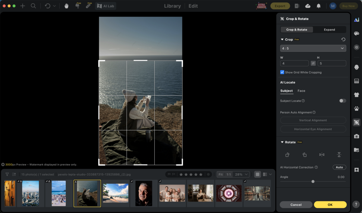
Then remove small distractions. If the frame is strong but one object pulls attention, Evoto’s AI Object Remover can help clean minor clutter such as trash, signs, dust, edge objects, and small background marks. Use it to support the original composition, not to rebuild the whole photo after weak framing.
Editing workflow showing small distraction cleanup and crop refinement on a simple composition
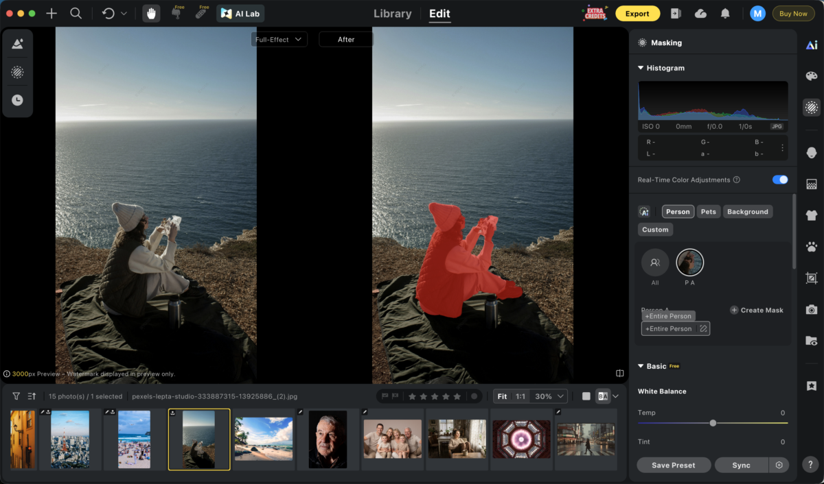
Next, control local attention. Sometimes the issue is not an object, but one area that is too bright, too saturated, or too contrasty. Evoto’s AI Masking Editor can help isolate the subject, background, clothing, or specific parts of the frame so you can reduce visual noise without flattening the whole image. Evoto’s guide to local adjustment is useful here because many simple-composition fixes are local fixes.
For high-volume work, consistency matters. A clean style can fall apart when one image has a warmer background, another has a stronger crop, and another carries extra edge clutter. Evoto’s Batch Edits can help apply a consistent baseline across similar images after the key composition decisions are made.
Good post-production should not make the image feel over-cleaned.
It should make the intended subject easier to see.
A Simplicity Checklist for Photographers
Before you shoot, ask:
- What is the subject?
- What should the viewer notice first?
- What can I leave out?
- Is the background helping or competing?
- Is there clean negative space around the subject?
- Are any bright objects near the edges?
- Is a line cutting through the subject?
- Would moving closer make the photo stronger?
- Would a longer lens or wider aperture simplify the scene?
- Does the color palette support the subject?
Before you export, ask:
- Did the crop improve the reading order?
- Are the edges clean?
- Are small distractions still pulling attention?
- Does local contrast guide the eye to the subject?
- Is the background clean enough for the image’s purpose?
- Does the set feel consistent?
- Did editing remove clutter without removing context?
Simplicity is not a rule that makes every photo quiet.
It is a discipline that makes every choice easier to read.
Final Thoughts
Simplicity in photography composition is not about making every image minimal.
It is about making every image clear.
Start with the subject. Decide what the photo needs to say. Exclude what does not support that message. Use negative space with purpose. Simplify the background. Watch the edges. Control light and color. Then use post-production to refine the distractions that real shoots leave behind.
A simple composition can still have texture, emotion, movement, and context.
It just does not ask the viewer to fight through clutter before they understand the photograph.